
This is a blog post that goes along with the most recent bonus pod! You can listen to the first 15 minutes of the bonus pod below, but you’ll have to subscribe on Patreon to get the RSS feed of the full episode (as well as access to our Discord).
Also, this was originally just going to be about the menswear in the movie, but I couldn’t help myself and wrote about how cool the comics were. Enjoy a long bonus blog (which is always free anyway)!

“Everybody knows him. That’s Tintin!”
This line from the film adaptation (said by a man in a rollneck, newsboy cap, and faded chore coat, no less) was so funny to me because, as much as I was fascinated with Tintin as a kid, no one around me knew anything about him. Even in the bonus pod, Spencer and MJ both say that their main exposure to this adventurous journalist (who also functions as a detective of sorts) was through my own obsession. For that, I have my Canadian father and cosmopolitan mother to thank; a combination of contexts that explains my connection to Tintin.
The first Tintin comic I had was the “oversized” issue of The Shooting Star, where Tintin and his new friend Captain Haddock escort a scientific expedition to recover an asteroid that has landed in the middle of the ocean– and it’s made of a material not known to our world (dubbed later as “Phostlite”). This singular issue was later supplemented with Volume 8, which contained stories about a military coup in South America, an island rescue for a kidnapped millionaire (that also includes aliens), and an opera diva who overstays her welcome. I read these over and over again and ultimately begged my parents to buy me the rest of the volumes. They’re still with me to this day, though my beloved Volume 8 had to be repurchased years later because it was falling apart.
Looking back, Tintin was an interesting thing for me to read as a kid. It’s not that a kid can’t read them, but that the adventures that Tintin and Co. went on weren’t exactly fantastical. They were grounded and realistic. Tintin wasn’t fighting supervillains like Spider-Man, nor was he stopping evil geniuses bent on world domination like James Bond. Instead, this be-quiffed reporter takes on gangsters, counterfitters, smugglers, and the occasional thieving magpie. It’s more adventure, mystery, and political thriller than it is typical comic (or even manga) fare, which only made it more appealing to me. The connotations to Indiana Jones were quite clear; Indy and Tintin do indeed try to procure cultural artifacts and go up against agents of authoritarian governments on more than one occasion. The fact that it was period-set (another similarity to Indy) still made Tintin comics feel like “another world” that I could immerse myself in.
It’s no surprise that my taste in movies, as well as comics, stems from religiously reading Tintin. Of course, these comics contained more than just fun adventures steeped in political and cultural commentary. They were also incredibly menswear-friendly.
[I should also say that Tintin comics are absolutely a product of their time. Hergé does indeed have racist illustrations and depictions, especially in the earlier stories. That being said, it’s clear that he became more progressive and empathetic as time went on. In The Red Sea Sharks, Tintin and Haddock go up against slave traders. Tintin in Tibet is rather heartwarming in how far Tintin goes to find Chang, who was based on a real-life friend Hergé made while researching The Blue Lotus. However, these are far from perfect and still replete with problematic depictions. As such, I’m not going to discuss the outfits of those characters.]


I always loved Tintin’s outfit. It’s simple but ultimately distinctive and decidedly vintage (even I knew from a young age that it was a bit “old” school because of his funny little pants): a white shirt, a light blue crewneck sweater (which allows the shirt collar to peak through, tobacco brown plus-fours (also known as knickers), white socks, and derbies.
The outfit is the definition of a 30s sportswear look, being sartorial (especially as his knickers have a matching jacket) without being formal or too business-y. This neutral-yet-pointed look allows this reporter to fit in anywhere, from hunting bric-a-brac at the local flea to meeting a king who has lost his sceptre. Spencer’s practical Americana style that blends workwear/milsurp with ivy-prep functions the same way; he has to look approachable but also a bit “dressy” as needed. And because it’s such an easy look, it makes sense that our youthful protagonist wears the rig in nearly all of his adventures (and across all manner of contexts and occasions), cementing the rig as his Hero Uniform. It functions similarly to Superman’s red and blue leotard or a certain archaeologist’s steadfast adherence to a safari shirt, officer trousers, A-2 jacket, and brown fedora.
What makes Tintin’s outfit quite iconic to me is how he sticks by his Uniform even when fashions change around him. I’m of course referring to his maintained use of knickers, which, being a novel and sporty garment (compared to long-trousers), faded from mainstream fashion around the 50s. Tintin (and by extension, Hergé) seems to have really liked the damn things, and so he’s seen wearing them even when fashions – and the times– changed around him. It is quite funny to see knickers on a jet, but it’s honestly charming and ultimately admirable. If we like something, we should stick with it, even if it’s not in vogue!
That being said, Hergé does give us a small taste of a modernized Tintin in Tintin and the Picaros, which was published in 1976: the famous plus-fours are finally swapped out for a slim-straight, bootcut (or slight flare) trousers. The change does do wonders in making him more contemporary, especially since a blue sweater with a bit of shirt collar peaking out is a look that transcends any era.
What makes Tintin’s fashion even more interesting is the fact that he actually does change up his look, as rare as it is. He is no clothes horse, but it’s clear that Herge wanted to make Tintin dynamic and ultimately reflective of how a real person would dress. Sometimes, Tintin eschews the blue sweater and rocks the white sport shirt on its own or swaps it out entirely for a yellow polo. Tintin also occasionally gets to dress up, wear the matching jacket to his plus fours, and don a tie; you might even see him wear a yellow sweater vest as a pop of color (he seems to own a grey one that he wears sans jacket and tie). There’s also the practical, adventure-forward choices. You’ll no doubt recall the iconic balmacaan-style trench, but there’s also the hiking anorak when he treks through the Himalayas to find Chang, or the hooded fur parkas when out in the Arctic.
I also can’t forget to mention the cultural looks that Tintin gets to wear. In the early stories, Herge liked to put Tintin in outfits that matched the setting of his current adventure, a move that was later co-opted by Thompson and Thomson, Tintin’s clumsy, non-fratriarchal officers from Interpol. This is best shown in Tintin in America, where he gets to wear a blue checked western shirt, black chaps, a red bandana, and a big ass cowboy hat; it helps him blend when he tracks down a Chicago gangster to a remote western town.


This mixture of adherence and subversion to emblematic attire is also represented in Captain Haddock, Tintin’s best human friend. We almost always see Haddock in nautical mode, wearing a captain’s hat, black suit (or at least a black sports coat and trousers), brown derbies, and a chunky turtleneck emblazoned with an anchor. The practical, maritime knit is decidedly blue, no doubt as a shout to Tintin; it can even serve to show that the drunkard is indeed a good guy, even if the treacherous crew of his ship, the Karaboujan, has decided to align themselves with opium smugglers.
After a tropical expedition and jaunt on the ocean floor, Haddock gets to inherit Marlinspike Hall, his old family estate. The prickly sea dog has suddenly become quite rich, and with the wealth and fancy digs comes a handful of new threads. Hergé lept the chance to put Haddock in pastiches of old money, which is both comical in showing just how pretentious Haddock is and serves as a great example of the expressive power of certain menswear combinations. It’s also just cool to see these things rendered in comic form.
When at home, Haddock can be seen in a homburg, paddock jacket, the occasional tattersall, jodhpurs, and, in true stereotype fashion, a monocle (which he keeps shattering). It’s an obnoxiously equestrian look, bolstered with fancy-speak, but there’s never any true indication that Haddock even owns a horse or knows how to ride one; even if he does, it’s almost certain that it’s just for putting on airs. Haddock finally mellows out his pretentiousness by the time of The Castafiore Emerald, where the fanciest he gets is a navy blazer and grey trousers. It’s clear Haddock wants to “dress the part”, but when it comes time for an adventure, he leaves the dandy garments at home and returns to his trusty black suit and turtleneck.
In the end, the epitome of truly static style, no matter the context, within the Tintin comics comes courtesy of Professor Cuthbert Calculus. Our lovable, hard-of-hearing inventory acts the goat in the same look in every story he’s in, and like Tintin, his chosen rig is a bit anachronistic: a green DB overcoat with a matching bowler, black trousers, a yellow waistcoat, and a tall, stiff club collar that surrounds a very slim tie. Calculus’s look evokes the attire of early 20th-century scientists like Dr. Robert H. Goddard, who can indeed be seen wearing a similar coat.


It’s clear that Hergé had a lot of fun when dressing his main characters, but that’s certainly not the only place good style can be found within his comics.
Like Marty Supreme and Train Dreams, everyone contained within the comics (and later, Spielberg’s film) is very stylish. Through the careful balance of detailed illustration with clean lines, each of the sartorial nuances (and boy are there a lot) allows Herge to express people’s personality and context while still being realistic and true to the setting of mid-century Europe, which is obviously inherently more sartorial than America.
With all of the menswear goodies found within, the Tintin comics can feel almost like an Apparel Arts illustration, just with a plot. Herge forgoes getting too deep in the weeds with specific shirt and tie patterns, but the amount of detail he does provide is astonishing. Stroller suits (complete with cutaway tailcoats), jodphurs and riding boots, frog-closure smoking jackets, tattersall waistcoats, peak lapels, belt backs, bomber jackets, homburgs, yellow gloves– these are all real elements of midcentury menswear manner, and they can all be found all over the pages of Tinitn’s adventures. To be clear, Herge’s comic was never a direct source of inspo (that was still reserved for old photographs, Apparel Arts illustrations, and dramatic fitpics from The Armoury (and the fun stuff from Drake’s).
It really is fun to see just how Herge pairs pieces together. The obnoxious insurance salesman Jollyon Wagg gets a purple suit and a two-tone sweater vest. Igor Wagner, Castafiore’s accompanist, dons a Chesterfield coat when he’s introduced; his grey SB suit also seems to have piping, almost hinting at Tyrolean suits of the period. J. W Muller gets to wear riding boots, breeches, and a green sportcoat (complete with a fedora). Rastapopulus gets to wear a frog-closure DB smoking jacket in an early apperance and is last seen in a pink western (with a bowtie), a cattleman hat, and jeans tucked into very flashy cowboy boots. There’s just so much going on!
It all definitely blew past me when I was a kid (I just thought everyone looked fancy), but as a seasoned enjoyer of vintage menswear, it just made re-reads that much better. To be clear, Herge’s comic was never a direct source of inspo (that was still reserved for old photographs, Apparel Arts illustrations, and dramatic fitpics from The Armoury (and the fun stuff from Drake’s). It all definitely blew past me when I was a kid (I just thought everyone looked fancy), but as a seasoned enjoyer of vintage menswear, it just made re-reads that much better.
Each nattily dressed character, from the supporting cast to the background players who only appear to color a scene, all serve to make Hergé’s universe that much more vibrant and dynamic. This is especially noticeable when compared to modern comics, where classic menswear is done as generic two-button, plain colored renderings. (The same point can be made when comparing the costuming of old films, or even Wes Anderson, to modern ones.) But even at a young age, I knew just how cool Tintin looked…as well as everyone else illustrated on each maximalist panel. Nothing in Tintin was generic; each outfit is intentional and decidedly bold.
Thankfully, Steven Spielberg and Peter Jackson kept that spirit alive when they decided to adapt Tintin.

Now, before you ask, I had never seen the animated TV series. It came out before I was born, and even then, it was on HBO (in the US), which my family did not have. No, for me, Tintin only existed in comic form. Until, of course, they announced that Spielberg and Jackson were doing their own movie based on the intrepid reporter and his dog— and that John Williams was going to do the score. My body was ready!
It wasn’t hard to see why I was so excited to see this movie. And it wasn’t just because this would be my opportunity to see my favorite comic character come to life; it was just my way of getting an adventure movie at a time when we didn’t have much of it (and we still don’t).
2011 was an interesting year for adventure movies. Star Wars was already long gone, with the last prequel coming out nearly six years prior. Pirates of the Caribbean’s epic trilogy ended in 2007. Indy tried to come back a year later with its even more grizzled lead actor, but people didn’t like the whole alien thing (maybe time travel would have been better). RDJ’s Sherlock Holmes was cool, but that was also two years ago. Even the Man from U.N.C.L.E, a fun period spy thriller (compared to the brooding and modernized Craig-Bond), wouldn’t be released until 2015 (which is when Star Wars would return as well). My tween self was starved for adventure, and Spielberg quenched it.
Spielberg’s classic style of grounded escapades with a sense of whimsy, all wrapped up in an air of nostalgia, was obviously perfect to properly bring Tintin to the big screen. The original two stories are not that action-packed, being simply about a mysterious treasure (The Secret of the Unicorn) and stopping opium smugglers who had mutinied against their drunkard captain (The Crab With The Golden Claws), but Spielberg and co. really fleshed it out and made aobetrotting flick that is as exciting, dynamic, and just as visually impressive as its namesake comic.
Of course, a lot of it had to do with the fact that they utilized mocapped computer 3D animation; the idea was to bring the comics to life, at least as much as possible. And while the character designs are a bit uncanny, the use of computer animation allowed Spielberg even more possibilities when making the film. He makes full use of crazy camera work and wild transitions, which you could never do IRL (without being cheesy) or in the comics. The sheer insanity that is the ship battle makes the entire decision to use computers worth it; I don’t think any pirate ship scene will ever come close, and I’m even counting the maelstrom from At World’s End. I also love the Falcon chase sequence, which is an incredibly dynamic oner. Only Spielberg could direct such a chaotic scene–– all while making sure that the action is easy to follow.
Of course, a big draw for me was not just having an adventure flick again, but also that I could get more music by my man John Williams, whose last film score was indeed the fourth Indy film. Most of Williams’s music from this period leaned toward the dramatic (before Tintin, he did Munich and Memoirs of a Geisha, and after, he did War Horse and Lincoln), which I do enjoy, but again, being a tween who was slowly starting to embrace his maximalism, I really wanted something fun and exciting, without being epic. You know, something like Indy without being Indiana Jones. In other words, something like Tintin.
Like all of his other filmworks, Williams crafted a plethora of themes and an assortment of motifs that pop up repeatedly throughout the score. Tintin is represented by a short, sprightly fanfare that perfectly encapsulates his determined and youthful air; the theme gets a minor-key variation when he’s sneaking around– or when he’s in danger. (Williams also provides a plucky motif for by staccato woodwinds and pizzacato strings when Tintin is in detective mode). Woodwinds also get center stage for Tintin’s compatriots Snowy and Captain Haddock, who get a playful ostinato on flutes and a slurring bassoon/clarinet-forward jig, respectively. The bumbling Thompson and Thomson even have a comically confident European jazz-esque motif for piano, accordion, and euphonium.
However, the real star of the score is the material for the titular Unicorn. The mysterious, minor-key theme (which feels like a mix of the Force theme and some of the general vibe in Harry Potter) is peppered in the first two acts, playing while Tintin attempts to uncover its secret, as well as evade Saccharine’s conspiracy. Once Captain Haddock is finally able to recall his ancestor’s tale about the ship’s final battle, Williams gets to unleash the Unicorn theme in full bombast. That cue is our only indication of what a swashbuckling pirate score by John Williams would be like (though Hook is close).
In fact, that’s what makes this score– and ultimately the movie and the comics– quite special: it’s a playground to delve into multiple genres.
This is clearly expressed in the breadth of music that John Williams was able to compose for the film. An establishing shot of Bagghar gets a fanfare in the vein of Lawrence of Arabia. Williams goes into noir mode with breathy flutes and saxophones when Tintin first finds the Unicorn’s scrolls and then gets into muted trumpets and somber horns when Agent Dawes suddenly gets shot by unseen gunmen, lit by dramatic streetlamps. He gets to do an intricately Mickey-Moused cue for Haddock and Rackham’s sword fight, something Star Wars never let him down (those scores always leaned more epic). The Falcon cue provides an opportunity to adapt Gonoud’s “Je veux vivre” for Castafoire (0:00-0:12) and even a virtuoso flute solo for Saccharine’s thieving bird. Quite a bit of the film even allows John Williams to return to his jazz roots, for both instrumental music and orchestration; jazz just makes sense for a midcentury European film. The cue for the opening titles (shared above) is one of my favorite jazz pieces, being superior in my eyes to the one for Catch Me If You Can, simply because, well, the Tintin one is much more intricate and fun— Williams includes a harpsichord and even a quick solo for tubular bells!
What other film could let you do all of that?

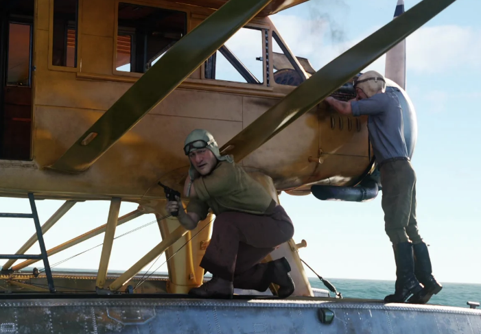
It goes without saying that The Adventures of Tintin is one of my favorite films (comfort-wise), giving me everything I wanted and more. Much like Hergé’s original comics, the film is jam-packed with detail, with new things to catch on every watch. But something I noticed on a few of my latest rewatches was that the menswear was actually quite good.
This was surprising because computer-generated 3-D animation tends to leave a lot to be desired when it comes to tailored menswear, especially when compared to the effort found in 2D animation like Studio Ghibli. Even though Tintin was a period film, I must have simply thought that the clothes were just rendered as regular ‘ol suits with a few fedoras thrown in to express the period setting. But the more I kept watching over the years, and the more menswear knowledge and Tangible experience I gathered, the more I realized just how impressive the costuming was for this movie. Not only did the filmmakers follow Hergé’s blueprint for styling (all of the outfits are lifted directly from the pages of his comics), but the 3D clothes literally look like real-life garments.
It was soon made clear to me that the only thing more uncanny than the faces in The Adventures of Tintin was the clothes.
Each garment on screen looks and drapes authentically, adding to the realism of this “comic” come to life. In many close-ups, you’ll see that the clothes not only have seams but also have their genuine textures, all differentiated on the cloth from their real-life counterparts. Knitwear all looks nubbier than the smoother worsteds found on jackets and trousers. Even the latter has different textures depending on the pattern and weave. It’s not even enough that Tintin wears his iconic Mac-style trench coat– the filmmakers took extra care to show that it’s made of cotton gabardine, which is exactly what trench coats are made of.
But just like with IRL menswear, material is only one side of the story. The aesthetic design details also matter, not just because Tintin is a pseudo-period film, but because Hergé certainly made sure these sartorial nuances were always included in his own comics. This is no small feat considering both the comic and the film are densely packed with all manner of tailored outfits: business attire, sportswear, black tie. It would be quite easy to simply have people wear a non-descript suit that is textured like a real one. But thankfully for vintage-menswear obsessives like me, VFX costume designer Lesley Burke-Harding and her team hit it out of the park.


It is astonishing just how many vintage sartorial details are rendered faithfully in the film. Yes, everyone’s trousers are high-waisted, but it’s more than that. Sport shirts have their long camp collars, with a few sporting the flapped twin breast pockets. Cutaway tailcoats retain the horizontal seam below the buttoning point. Fedoras and homburgs can be seen with edgebinding. Even the lapels all look accurate, being a medium-to-wide width and a droopy, blunted notch– the look that defines a lapel’s appearance throughout midcentury suiting. This can be seen to great effect in Mr. Saccharine’s red overcoat and shadow-stripe suit, Thompson and Thomson’s matching black suits, Barnaby Dawes’s peak-lapel number, and, of course, Tintin’s iconic tobacco-brown plus-four suit. But there’s even more fun to be found!
In true 1930s fashion, Tintin’s “sport-suit” is rendered with a proper half belt that is surrounded by gathered pleats and a bi-swing back. Not only that, but the matching plus-four trousers are even shown to have the shallow, double forward pleats that are found on actual, real-life knickers. You see, it’s not just that the movie gets Tintin in any brown suit. It’s very specifically shown to be a 1930s-style tobacco brown knicker suit with all the sporty details that such a garment contains. Outside of standouts like Killers of the Flower Moon and Sinners, we seldom see these niche vintage details in films anymore, let alone animated ones.
Of course, we must give credit where credit is due, and it’s clear that Hergé did a lot of the styling legwork in his original illustrations. As I stated earlier, the Tintin comics contain all manner of sartorial nuances for outfits worn by protagonists, the villains, and especially the background characters. Hergé never made anyone “generic”. Dawes is drawn with a hint of a peak to his lapel, the dandy Mr. Silk has a wing collar and cutaway suit, one of the pilots is indeed wearing a bomber jacket with rolled up sleeves, and Tintin’s sporty jacket is illustrated with a single rectangle on the back to show that he is indeed in a belt-back suit. The comics truly serve to exhibit the wonderful menagerie that is midcentury menswear! But at the end of the day, the comics are in the clean Linge Claire style, and despite all of the intentional details, the clothes are still drawn simply. It was still up to the VFX team to fully bring them to life to match the realistic nature of the film. And boy did they succeed.
If you look closely, you’ll find that Silk’s computer-generated cutaway coat has a seam going through the middle of the coat, just like the ones in real life. Tintin’s yellow sweater vest isn’t just fuzzy to show that it’s a knit; the digital asset also contains the wide, vertical ribbed weave that is found on the true 30s/40s sweater vests that I own (a feature that also serves to separate vintage knitwear from modern ones). And even apart from these niche details, I love that the VFX team took care to add in patterns. Vintage menswear was more than just solids and weaves, you know, and this certainly needed to be the final move to make Hergé’s expert styling truly come to life. Saccharine’s red suit has a tonal stripe, Hergé’s cameo is wearing a green guncheck, and during the Bagghar scenes, you’ll see someone in houndstooth.
It’s almost as if the animators had the equivalent of a costume warehouse full of digital true vintage garments to dress everyone in the film.


All of the VFX attention to detail and realism, combined with the saturation of Hergé’s original drawings, results in an incredibly vibrant costuming palette. Outside of a Wes Anderson film, I can’t imagine any other modern film that is dressed this fun and strives to be period accurate…or at least decidedly “vintage”.
I say that last part because when you contrast the various fedoras, the presence of cutaway coats, and some decidedly 60s styling (I’m looking at you, Hergé-cameo), the outfits found in Tintin feel like a mix of 1920s-1960s styling. It’s a bit all over the place! You’d think that I’d be a stickler for strict period accuracy, but the anachronism in the film is meant to be intentional.
One quick look at the IMCDb and you’ll see that the cars in the film (all taken from iconic cars from the comics) were made in the 1930s-1950s. You might argue that, much like today, people in the 50s, people would still be driving cars from twenty years prior. But here’s the thing: the “old” cars we encounter aren’t meant to be junkers. Such cars, much like various anachronistic outfits, are meant to co-exist, creating a vintage malaise that characterizes this film and by extension, the comics (which a few were written in the 30s and redone in the mid 40s and 50s) After all, Tintin’s attire is intentionally antiquated in his own stories, wearing 30s-style knickers even all the way into the 60s. He’s not old-fashioned– that’s just who he is!
It makes sense that the filmmakers would retain this antediluvian attitude when creating their world. It’s not that the movie doesn’t know what time period it’s in, but that it exists outside of time to begin with. This move is quite charming and ultimately serves to make the movie, by extension, the comics stand out among other pieces of media. The Adventures of Tintin is its own universe– one that feels familiar and close to our own, but also has clothes, cars, and architecture from various periods…and where a reporter and his faithful dog can find sunken treasure, stop a fascist takeover, and go to the moon.
[To be clear, the Tintin comics were indeed meant to be “modern”. When the serials were turned into albums, Hergé took the opportunity to update the cars and some outfits (including some more problematic panels) to reflect the period in which they were being republished. You can find examples here, but it does go without saying that even through these revisions, Tintin really does stay in his 30s plus-fours!]
And so, even if the clothing is entirely computer-generated, The Adventures of Tintin deserves its spot in the annals of “certified menswear movies”. It’s obviously silly, but the outfits really are incredibly well done. In what other [modern] flick can you see a belt back, white tie, and chunky, saturated knit wear all in one place? What this all tells me is that we need more fun period movies— especially ones that leverage the infinite variety that is vintage menswear.
With Indiana Jones being dead and James Bond being perpetually updated for the modern era (not exactly a bad thing), I think we’re due for Tintin to return.
[Yes, Wes Anderson exists, but sometimes you want a globe-trotting adventure and not meta-commentary on the artistic process or a family drama. Though The Phoenician Scheme does work for these parameters. ]
I also might need to finally own some plus fours.
– end of blog post –


Thanks for listening and reading along! Don’t forget to support us on Patreon to get some extra content and access to our exclusive Discord.
The Podcast is produced by MJ.
Always a pleasure,
Ethan
Big thank you to our top-tier Patrons (the SaDCast Fanatics), Philip, Shane, Henrik, and Mason.
