It’s long, deal with it.
It’s been a while since we’ve done a post on actual style advice; a lot of the articles have been pretty educational as of late. Well, seeing as it’s summer, I thought that it would be pertinent to give of some ideas on how to dress. Something that we’ve loved doing to make an interesting outfit in hot weather (that has direct connotations to the 1930s-1940s) is by going high contrast.
A lot of summer articles from menswear accounts advocate to choose light colors, in order to repel the sun’s rays. Outfits with light blues, pastels, and khaki dominate the mainstream world. Drake’s wrote a great article about Neutral Territory as a look for summer. It’s not a bad look, but it’s something a little too expected. That’s why we advocate going high contrast.
Now going high contrast doesn’t mean that you need to do something too crazy like wearing colors that evoke the latest highlighter collection. Instead, we recommend utilizing the earth tones that love so much, and play them in a way that’s slightly unexpected: dark and light. By this we mean saying a dark brown jacket with cream trousers or a white jacket with navy blue. We definitely don’t advocate bright red blazers with stark white trousers; that’s what you’d wear to pitti. Our approach is more subtle that still utilizes saturated color. It’s almost like using deep fall coloring made of summer fabrics (linen, summer wool, Palm Beach) with other light pieces to make it a warm weather outfit.
It’s a goes against the grain since light colors are normally needed to fit in better with the bright summer sun as well as to lessen the attraction of heat. I’ll still maintain that deep, dark saturation is still great, especially when you contrast it with a different, light colored piece. You’ll see illustrations and photographs from the 1920s-1940s that show off the high contrast look with great execution. It’s still filled with color, but it’s a more mature way of doing it.


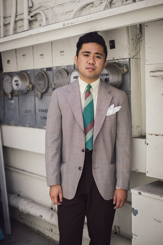
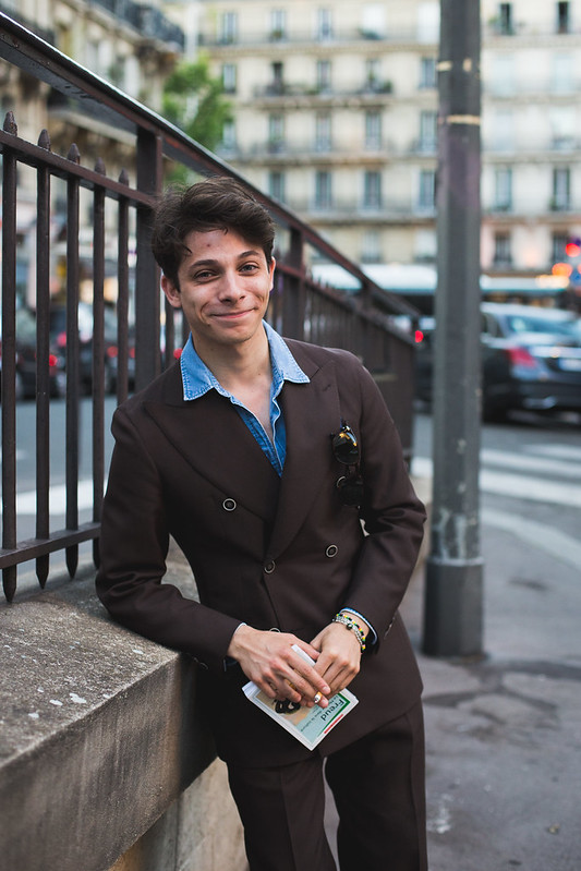
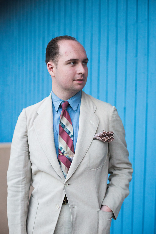
Burgundy in summer? Yes sir!

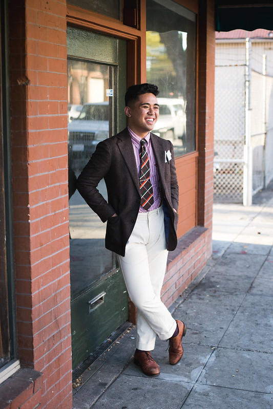
A great casual ensemble that uses high contrast without going too bright.


Light jacket + Dark trousers.

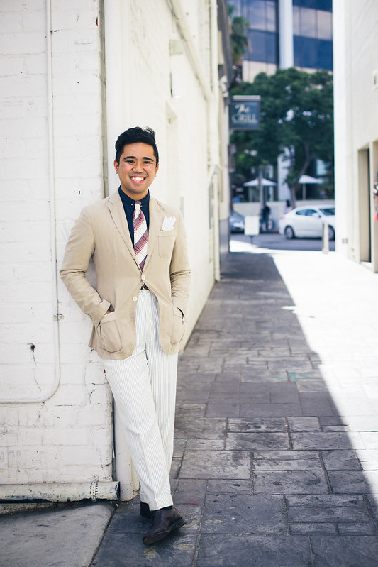
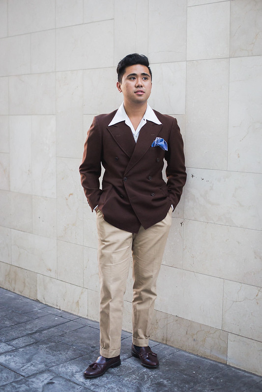
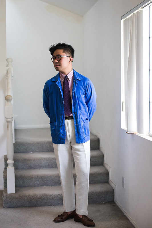
A great casual ensemble that uses a dark top and a light bottom!

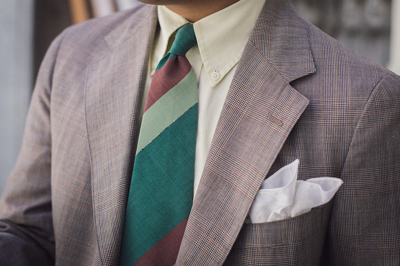
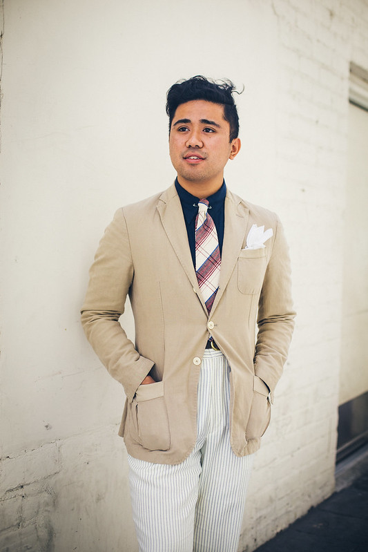
Saturated shirts.
Here’s where it gets radical. Most guys today hate wearing light colored ties; we’re usually taught that our ties should be subdued or even darker than the rest of the outfit. This is why navy blue or even black knit ties are the best one’s to get, because they work with everything. But we don’ want to be typical, now do we? Why not try a light colored tie?
Light colored (cream, white, etc) are usually hard to wear, so they aren’t for beginners. I think it looks wonderful paired with a blue denim, linen, or chambray shirt, in order to emphasize the “summer” theme. Careful attention to texture, pattern, and coordination with the rest of your outfit is the only way to prevent yourself from looking like a dreaded high school prom attendee.
You can see that guys back in the day used to wear this look with their suits and sportcoats. Balancing the shades is also key to creating the entire look. It’s up to personal preference on how you do it though, but it normally involves a dark shirt to offset the jacket and the tie.


A great fuckin’ look.

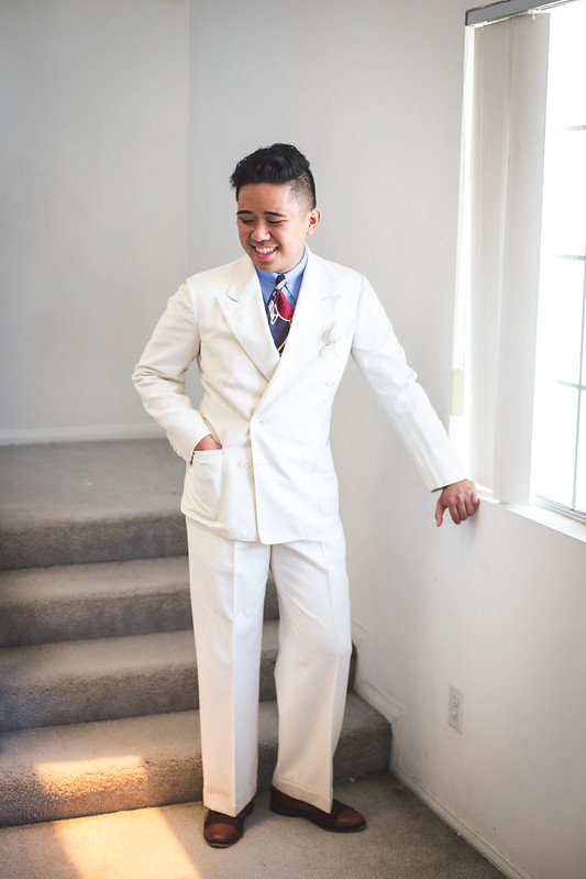
An outfit from the 1930’s that Spencer and I really enjoy. The high contrast in the outfit is just enough to make it perfect for summer. In fact, it’s what inspired me to write this article!
Today
You don’t really see high contrast outfits today that are in the same vein as the vintage examples. However, there are a few guys out there who do it in some form or another.

Ethan Newton does one of the original high contrast looks that’s been adopted as the ivy uniform. Light khakis with a deep navy jacket is enough to be worn year round, though it’s perfect for a conservative summer outfit. Did I mention that the the block stripe tie reminds me of ones done in the 1930s’?

Here Ethan does a true high-contrast summer look. He wears a light jacket with with some dark navy trousers; it’s the opposite of the ivy look posted above! White trousers would definitely be a move straight out of Pitti, but I think this combo is much more mature.

Drake’s using a dark “inside” to provide high contrast to the light colored suit.

Simple high contrast, using a dark brown and white.

This look by Chad Park (left) is one of my favorites because of it’s use of color in the high contrast outfit. Deep forest green should be used for fall, but it gets a summer work out here when it’s worn with white trousers. Most pitti guys would go for a light green jacket (maybe even lime), but high contrast is a more interesting choice.

Dark polo shirt with a light suit.

Here Chad Park again uses high contrast, this time providing it with his shirt and tie. It’s something a bit different than we’ve seen before, but it’s still perfect for summer. Just look at the contrast between his light, seer sucker suit and his dark blue gingham shirt and deep orange tie. Pretty fun, right?

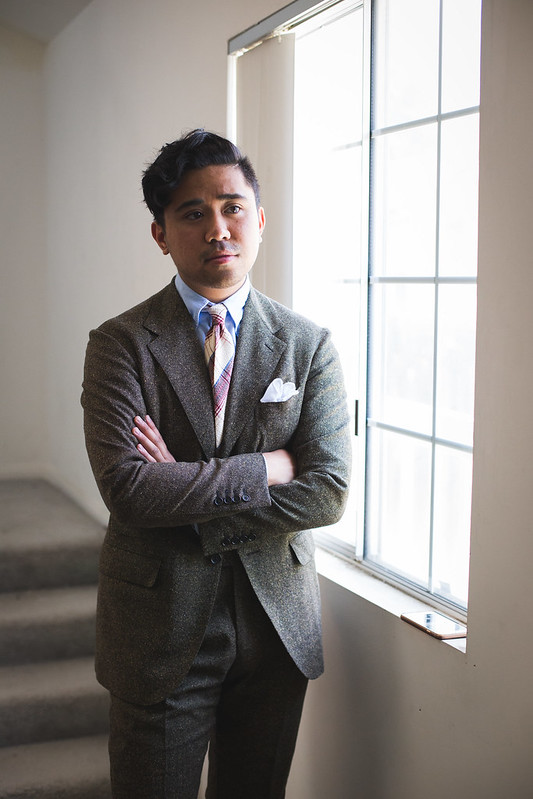
Excellent summer suiting with high contrast between the shirt+tie and the suit.

So we decided to provide some examples with some new, never before seen outfits that utilize high contrast! There are definitely different levels of committing to the look, so hopefully one will work for you!
Navy and Khaki – Easy & Classic
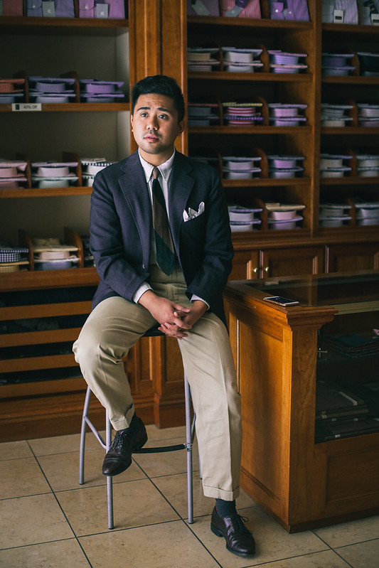
Going Ivy may be cheating, but you can’t deny that it’s a high contrast look that’s done well. Not many of these could be worn year round or to the office! Here’s my summer ivy look that utilizes some stuff you haven’t seen yet: a hopsack OCBD, 1930’s grenadine tie, and dead stock 1950’s chinos. All of these are light weight and breezy which makes them perfect for summer!
Note here that the top half is pretty dark (thanks to the tie and jacket) which contrasts sharply with the light khaki of the chinos. It’s not too weird but this was put here to work for you conservative readers. It also gave me a chance to show off this ivy outfit, and lord knows that I haven’t done ivy in a while!
1950’s jacket, vintage hopsack OCBD from Roxy’s Vintage Deluxe, 1930’s grenadine tie from Reeses Vintage Pieces, 1950’s deadstock chinos
Light and Dark Brown – Slightly Daring
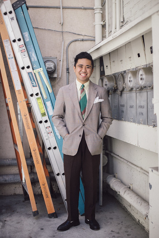
Using straight browns isn’t something that most people would recommend since it’s a “boring” combination. I don’t think they’re boring, especially when you use them in a high contrast way to make things interesting! I started with these dark brown rayon trousers (great for summer btw) as a base and ultimately decided on a light brown, plaid jacket for some visual interest! Like some other combos, it looks like it could be for fall, but the lightweight fabrics and textures make it summer appropriate. It’s a high contrast look that slips under the radar.
Peep those white socks and black loafers though. Ethan’s Ivy style returns again!
To emphasize the summer nature of this outfit, I went with some other unexpected pieces: a pale yellow shirt and a green stripe tie. I noted on an instagram live stream that no one makes great ties like these anymore! This one is a new favorite of mine that’s cut from a Palm Beach-esque fabric (probably mohair) and has a cool subdued green and red block stripe. It pairs wonderfully with the outfit, keeping everything on the top very light to offset the darkness of the trousers.
This is honestly one of the strongest looks that I’ve made. Everything about it just screams vintage! A part of me wants to say it looks vaguely 1970’s, but I know that’s just wrong…right?
1970’s suit jacket from Joyride Vintage, Brooks Brothers shirt (thrifted), 1930’s Wembley tie from Reese’s Vintage Pieces, 1950’s rayon trousers from Paper Moon Vintage, black Allen Edmonds Penny loafers (eBay)
Khaki, White, and Some Extra – Expert
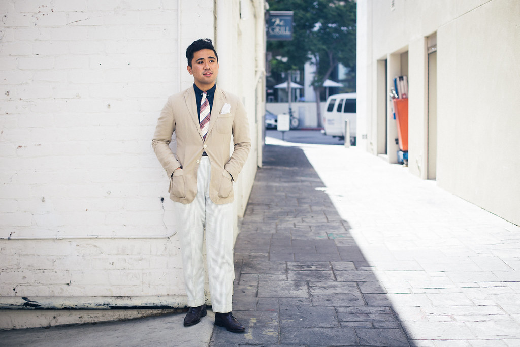
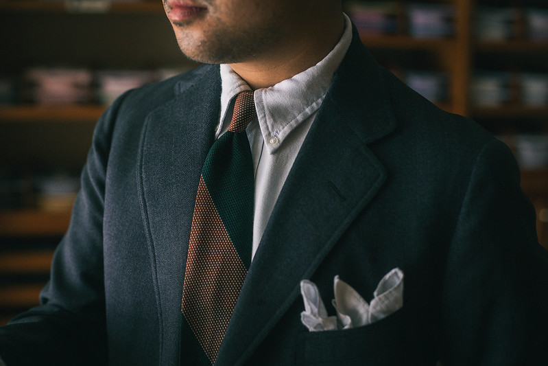
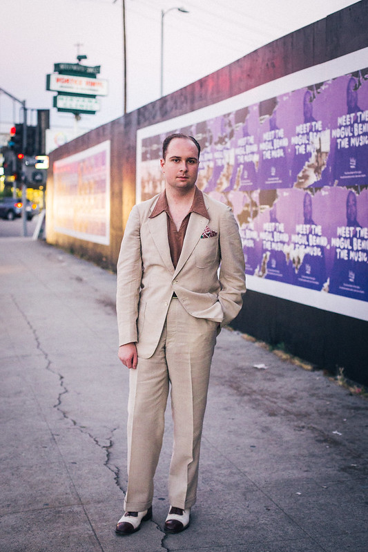
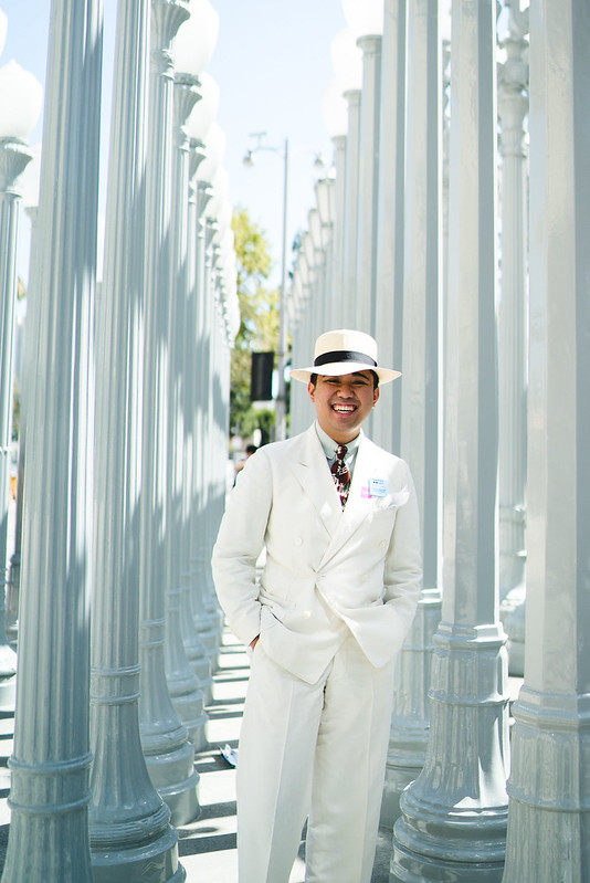
This is the outfit that was inspired by the cool 1930’s man photographed at the Griffith Observatory. The details are replicated almost perfectly: pleated tan patch pocket jacket, navy blue shirt, cream tie, and striped trousers. Most guys wouldn’t pair these items together, but I think it works well! The jacket is made of a cotton-linen blend, the shirt, is linen, and the tie is seersucker; the pants are an extremely lightweight flannel that feel more like dressy pajama pants than winter trousers. I think it looks like a dead-on interpretation of 1930’s summer style.
I will admit that if all of these pieces were smooth (like worsted or silk) it might look a little too much like a prom outfit. However, the use of wrinkly cottons, linens, and seersucker help add an air of expertise to the outfit; it also makes the outfit look more relaxed and effortless. That’s one thing to keep in mind when going for a high contrast look.
Obviously these piece are not straight from the 1930’s (except the tie). The jacket is modern, the shirt is bespoke, and the trousers are from the 1970’s that I got tailored to have a more contemporary look. However, when the styling is right and you add the correct accesories (like a collar bar and a period tie that looks like the 1930’s since no one makes ties like this anymore), you can create a vintage look. I’ve written on this subject a while ago, but I definitely want to emphasize that a Golden Era look is still attainable with modern pieces. 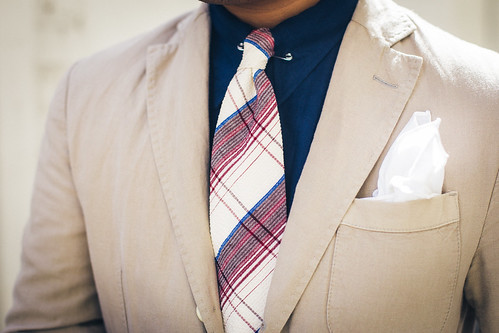
Cotton/Linen jacket from Massimo Duttie, bespoke linen spearpoint from Ascot Chang, 1930’s Seersucker tie (eBay), 1970’s striped flannel trousers (eBay), unknown burgundy wingtips (thrifted)
Other Examples from Us
We’ve definitely done high contrast outfits before, but I haven’t had the chance to share some of them with you! We typically shoot more outfits than we’re able to write about, so most of them get published on our personal Instagrams or they stay in our archive. I’m proud to be able to show them to you now! They’re old to us but “new” to you.

A recent outfit by Blake that utilizes high contrast.
I’ll let this one pass; it would’ve been better wth a darker polo!
High contrast with some patterns!
Easy way to do high contrast!
High contrast wth a dark green summer suit and a cream seersucker tie,
Light trousers and an interesting, darker colored top half.
White suits look best with dark ties to offset the brightness.

High contrast. Only the shoes and the jacket are light; everything else is pretty dark.

Ethan’s casual style with high contrast: dark navy shirt, light jeans and sneakers.


All dark except for the jacket!

Recent look from my instagram that is pretty high contrast!
Conclusion
While guys are returning to subdued summer looks (which again, aren’t bad), I’ve been sticking with high contrast outfits for a majority of my summer wardrobe. Wearing a dark jacket and light trouser (or vice versa) is also pretty easy, which is why I like to continue the contrast with dark shirts and bright ties. It’s hard to take away the initial “prom” connotation (just like the runaway collar and the 1970’s) but if you pay attention to colors, textures, and patterns, you can pull it off! Just look at my slouchy summer outfit as inspiration.
I hope you guys learned something from this blog post! I don’t expect many of you to jump on board soon (considering the flak from the runaway collar) but I think it’s a great way to spice things up during summer. In fact, you could think of my entire blog as an alternate approach to classic and vintage menswear. I’m just edgy like that.
Always a pleasure,
Ethan W.
Street x Sprezza

Your style is A+!
LikeLike
Hey Ethan, I live in a tropical country where it’s summer pretty much everyday and high humidity. How would you say you would dress in that kind of heat? (For me, at least, sweating is inevitable.)
LikeLike
If you need to wear a suit, Linen, cotton or a combo fabric featuring these (linen wool, cotton linen, etc) are choice.
If you don’t need a full suit, I’d still wear the trousers but I’d probably wear sportshirts, aloha shirts, or just regular shirts without a tie!
LikeLike
Awesome post! Keep it up. I really like the dark green suit.
LikeLike
Informative and interesting post, keep ’em coming! I agree with jamesworcester99 the dark green suit looks real nice, you should show it off in more detail sometime.
LikeLike
Hey thanks for reading! The dark green suit is the Camoshita suit I got a while back! You can see more detail in that post. https://streetxsprezza.wordpress.com/2017/05/16/i-got-a-camoshita-suit-for-75/
LikeLike