If my blog had an explicit thesis, it would most likely be: “you should be aware of the expressive properties of classic menswear and you can (and should) leverage them to create an intentional and personal look”. I truly believe that everything has an expressive quality and those qualities contribute not only to where your outfit ranks in formal dress codes, but to specific aesthetics, or cores as Gen Z would call it. Even this reasoning wasn’t explicitly stated when I began this blog eight years ago, exploring the broad, expressive qualities of classic menswear has been present every time I talk about my favorite things: spearpoint collars, berets, fedoras, wide leg pants, and so on.
But now it’s time to talk about something that I never covered during the tenure of this blog and podcast: The Pocket Square.
Is a Pocket Square necessary for a sartorial outfit??
The Pocket Square (or handkerchief) has certainly come a long way from being a utilitarian item that men would use to blow their nose, dry a tear, or dab the sweat off their forehead. It was originally kept on hand to prevent people from using their sleeves as wipes. People really liked having them so the Pocket Square went from being out of sight to being fully on display, placed in the front breast pocket of leisure, business, and evening suits. It’s funny how people’s love of a small piece of patterned (or solid) cloth resulted in one of the most superfluous items in the classic menswear canon. It became so popular that people would have two: “one for blowin’, one for showin” indeed.
O.E. Schoeffler’s Encyclopedia of 20th Century Men’s Fashion and Alan Flusser’s Dressing The Man both share that by the 1920s, the convention of men using Pocket Squares as a way to coordinate colors between their jacket, shirt, and tie was fully in swing. This was a time where suits where the de facto outfit of a man, unless they had a special work uniform or were doing manual labor. In other words, people like to be individuals and they want something more to do than just have fun with their shirts, ties, and suits. This little hankie that they were not using for blowing was the prime candidate to add some fun to the everyday look that they had.
Of course, the Pocket Square has fallen out of use today, as it is inextricably linked mainly to ties but also to tailored clothing, things that people don’t really wear much anymore. As a result, it has joined its tailored compatriots in the luxury approach to menswear, where pocket squares are mainly made by artisans due to how superfluous they are in the modern age; this is the fate that has befallen good shoes, nice ties, and obviously, beautiful suits. But even among suit wearers, it still occupies an odd space in people’s minds simply because of how its been positioned over the years.
Simon isn’t into it. And I go back and forth myself on whether or not to wear one.
Pocket Squares were seemingly worn at all times.
Contrast with color or pattern? Or do you match? You decide!
The Function of Pocket Square
It’s funny to think about how every menswear publication likes to start Pocket Square discussion by relaying the practical history of the handkerchief. It’s almost like they want to give the Square some gravitas in order to keep its tradition alive. That never worked for me.
Let’s be clear: Pocket Square squares all about adornment. More specifically, the Pocket Square is used for additional adornment in a tailored outfit, especially if the outfit incorporates a tie.
Like I said in the intro, the visible Pocket Square was meant to harmonize the colors between a shirt, tie, and jacket. In some cases, the Pocket Square could also provide additional visual complexity through its own patterns. It could also be used to anchor a fit or provide visual contrast, which was mainly used in solid pocket squares, like say a red hank to echo a red stripe or check (in the shirt or jacket) or contrast the existing colors. Pocket squares with different patterns and colors were (and have always been) popular among hank wearers because of their ability to be used across different outfits, echoing and emphasizing different things in each outfit you made. And then of course there was the white pocket square which goes with everything but often focuses more on formality since it is meant to bring out the whites of a fit; this is done to excellent effect in black tie, where a pocket square makes the most sense (imo).
You’ll note that I used the terms harmony and complexity in regards to what a pocket square provides. This is because Pocket Squares were never intended to match a shirt, tie, or suit exactly, even if the pocket square was solid. In Dressing The Man, Flusser includes a response an Esquireeditor made to a reader inquiring about Pocket Square etiquette: “It is undesirable to match the colors exactly, as this looks studied”. Though to be clear, matching tie and pocket square sets have been sold (and advertised to be worn as such) since the 1920s; Encyclopedia notes that a three piece set (which added matching boxers) was also a fad during the Golden Era.
Overall, it seemed that among those considered stylish or well dressed, choosing the right Pocket Square to harmonize an outfit without being matchy was meant to be a fun challenge that men could partake in as they got dressed everyday.
A 1960’s ad showing not just pocket square harmonies but different types of folds as well! It all plays into expression.
This challenge gets more interesting when you start to think about how you choose to display your Pocket Square.
Unlike a tie, where there is really only one right way to knot it (it’s called the Four-In-Hand), a Pocket Square actually has quite a bit of freedom. You could do the straight forward TV fold, having the solid color (usually white) echo the lines of the breast pocket. You could affix it at a slight angle to make it more pyramid-esque, to give it a bit more dimension (perhaps to expressively echo the belly of a lapel). Having the Square’s points come outward, whether as starched rows or messily done, make for a nice contrast to straight lines. And on that note, you could also do the puff, whose rounded appearance comes across as quite elegant.
It was clear to me that the way you displayed your pocket square contributed to your overall aesthetic expression. TV folds look streamlined and professional. Puffs feel subtle, yet sophisticated. Messy points sticking out feels rakish and has a slouchy (or sprezzatura-esque) charm. Seeing how their chosen fold played into their pocket square choice (patterned or solid) as well as their overall outfit (separates vs suits) was a master class in outfit expression.
Guys wore one even if they weren’t wearing a tie, which furthers the convention that a Pocket Square is meant to be the finishing touch of any outfit (that involves a tailored jacket). This all made sense if you consider the fact that a tailored jacket was designed with a pocket square in mind thanks to its exterior breast pocket (Flusser posits as such in Dressing).
I see the exploding white Pocket Square as a pertinent part of the 1930s aesthetic simply due to its ubiquity.
Eddy Robinson showing off some rakish charm with his exploding Pocket Square.
The slightly sloppy appearance helps play into the fact that these guys tend to look so comfortable in their suits…even if they’re wearing a 3PC with a collar bar (which most people would read as stuffy).
The slim, TV fold pointed toward the 1960’s Continental and Ivy-Trad vibes.
One might assume that as ties, collars, and lapels all got smaller, men wanted their pocket square folds to match. Suits are cleaner and more neat, so the Pocket Square should be too!
It’s a different vibe that still looks cool! In any case, a Pocket Square will always be an important part in an outfit’s expression, especially if you’re referencing a particular era.
All of this made my Cinematic Dressing-addled mind realize that a Pocket Square was essential to producing a vintage-themed look. I took note that most 1930s-1940s “folded” their Pocket Square in the “exploding” variation, with the points flopping out of the pocket (without care if it was a solid white or patterned square). I’m sure most movie stars and personalities knew that it looked quite rakish against a tailored outfit (usually involving a striped shirt and patterned tie). It was clear that the Golden Era was into a bit of maximalism!
This changed in the 1950s-1960s where bolder styles were replaced with the streamlined Continental and Ivy-esque attire complete with slim lapels and slim ties (that traded wild abstract foulards for stripes, solids, and vertically inclined designs). As a result, the exploding pocket square fell out of favor; a subtle puff or a TV fold (usually in white) was more harmonious to the overall aesthetic of this era. It wasn’t about corresponding to your tie choice, but about making a look.
As time went on, the importance of tailored clothing in the mainstream lessened as culture had opened up to accept non-suiting as appropriate everyday attire. While ties begrudgingly stayed on for certain professions and industries, it was Pocket Squares that really died off. It seems that the peak of a superfluous piece of fabric wasn’t required after all. Even Frasier, TV’s tailored cosmopolitan, seldom wore a pocket square (Armani, whom Frasier took cues from, seldom showed pocket squares); that affectation was reserved to be done by the flamboyant supporting character, Gil Chesterton. People began to see that a tie and jacket was enough to look fancy; the Pocket Square was just too much.
Forgoing a Pocket Square was a chic look. To me, it turns aa sportcoat into a “jacket that happens to have lapels”.
Pocket Squares ultimately became optional, with most people leaving them behind whether they were trad or not!
Even stuffy sartorially inclined characters like Frasier and Niles seldom wore a Pocket Square.
Could this be due to the rise of Armani? Who knows!
However, #menswear did bring back the Pocket Square.
With the advent of #menswear in the late 2000s, people began to return to pocket squares. Of course, this was because everything about classic menswear was coming back: suits, hats, leather shoes, and even other aspects of men’s dress like selvedge jeans and loopwheeled tees. So if tailoring was a part of what was “coming back” then the whole look needed to return as well, pocket square and all.
It seems there were two camps on this. The ivy-esque heyday Drake’s boys brought back the maximalist Golden Era vibe with a vengeance, wearing tweed jackets, uni-striped shirts and foulard ties with a novelty unicorn-tapestry print pocket square. Similar brands followed suit, producing pocket squares that featured works of art, allowing for more interesting combinations (or straight up pop) instead of relying on the traditional plaids, paisleys, and foulards that characterized classic pocket squares.
This use of triple or quadruple pattern mixing was the #menswear look which told men “hey if you’re getting into this, you may as well get into pocket squares too”. This new era turned hanks into a collectors item (almost like a watch) where guys (even ones with plain suits) would just have a handful of fun pocket squares to wear at their leisure. It was a way to signal a bit of whimsy without going full “nerd sock/cufflink”s. While harmony with the outfit was still under consideration, it was also clear that the pocket square was just a part of the look. And most of the time, it was an excuse to be bold as the pocket square took up such a small amount of real estate in an outfit.
On the other side of the camp, Jacket-but-no-tie dressers then leveraged the fun Pocket Square but used it more as a tie replacement instead of a harmonizing agent. In other words, they use it when they want to feel dressed up without resorting to a tie; it’s almost a reverse of what happened in the 90s when people kept ties but not the Pocket Square. While this can come across as a bit of a concession (and make the Pocket Square look a little out of place), some people do it justice. You might have seen guys at Pitti or at your regular mall wearing a fun pocket square with a sport shirt or a knit tee. It adds just a little bit of dandy interest when you aren’t looking to wear a tie.
All of this seems to point to how guys see the Pocket Square as a formality signifier or a status symbol instead of a tool to use in harmonizing an outfit: “I want to look ‘fancy’ so I need to wear a Pocket Square”. This has led to its latest de-surgence, as guys simply don’t want to appear that fancy. Suits (and to a certain extent, ties) have come back, but the Pocket Square just brings too much baggage with it. No matter what, a Pocket Square is inherently tied to formality and tie wearing (even if you aren’t wearing a tie).
If a guy needs to leverage a pop of color or to show off some personality, guys today tend to find other options, like a jaunty scarf, a bandana, or even using pins or pens. These things express character details in a bigger (or at least in just a different) way than just a tiny piece of cloth in a jacket pocket.
In the end, the choice to wear (or not wear) a Pocket Square depends on what specific vibes and overall aesthetic that you want to express with your outfit. And the good thing is that with Hank’s storied history in the realm of menswear, we have a lot of methods to choose from.
Even if they’re perceived as stuffy, I think that Pocket Squares can be fun, especially if you have a maximalist approach to menswear (usually done in shades of ivy-prep).
That being said, it’s hard to argue with how clean a look can be when you go sans Pocket Square. (This is Anglo-Italian)
I still think people can look good when you decide to include one! The choice is up to the wearer– there is no “right” answer.
For me, the choice to wear a Pocket Square is ultimately about the POV of the overall outfit.
How I Wear Them
My philosophy on Pocket Squares is all about if its inclusion makes sense for the outfit I am wearing. I definitely don’t follow the mantra that Hank is the finishing touch to every tailored outfit. That’s because I don’t believe that every outfit is enhanced by the inclusion of a Pocket Square. I know that most guys believe in that mantra, which when I do it, may result in a dandier outfit than I would have cared for. In reality, we live in a world where there are numerous avenues of accepted dress and expression, even within classic menswear. The use of a Pocket Square is nuanced and should be taken on a case by case basis, all dependent on the character-based aesthetic we want from our outfit.
In compiling the images for this blog/pod, I realized that I’ve always had this mindset. Whenever I did a Golden Era period accurate outfit (utilizing real vintage), I wore a pocket square (usually white) in the exploding fashion; for ivy or something more 60s, I did it in the TV fold (always white) . On the flip side, if I wanted something more modern/contemporary (a la Drake’s), I wore a patterned pocket square in a puff fold or in a fashion that showed off the main print and the points; I did take care to have it harmonize with some color in my wardrobe. Even though it was a subtle mood, I knew that these details would orient me to a specific look. I even did pocket squares when I wasn’t in a tie because I wanted to play up the “tailoredness” of it all (which is a very #menswear mindset).
As my journey progressed, I started to loosen up on my self-imposed rules by “subverting” Pocket Square convention and mix and match at will. Sometimes I did a TV fold with a 1930s look, wore a patterned Drake’s Pocket Square with a more period look, or paired an exploding white pocket square with a contemporary suit and tie. This method was admittedly a bit too random and it started to stabilize as I began to mature in my style.
A period look seemed to always need a Pocket Square.
The exploding pocket square was my preferred method in displaying it. It wasn’t just period, but it was also slouchy!
In a similar vein, I always felt that TV fold completed the ivy look.
Without it, it makes the POV fall a little flat. It also worked for more minimalistic combinations.
With its maximalist approach, a patterned pocket square always felt a little contemporary to me. That could just be because I always tied it to the #menswear movement.
As a result, I used a patterned Pocket Square to point away from a period look, even if my garments have an inherent vintage lean due to my taste.
As I expanded my expression, I also expanded my use of Pocket Squares. Here’s me doing a TV fold but with a 30s-inspired combo and a modern jacket and trouser. It created a general vintage vibe that referenced everything I enjoy!
I also used Patterned Squares with fully period looks. I think it looked pretty good! You can see that I kept the exploding method even if the square feels contemporary (it’s also vintage but whatever lol).
I also found that using the exploding White Pocket Square helped reinforce my vintage tastes even if my suits started. to be more contemporary. It was about keeping the vibe alive (though a true vintage tie and reproduction shirt help as well).
I still enjoy some #menswear moves, which is why I keep that era alive through the use of a patterned Pocket Square. It mixes well with this Drake’s-meets-1930’s outfit.
My use of the Pocket Square will always be about what POV I want to express. Nowadays, it tends to mainly be worn when I’m invoking period attire. I actually don’t wear a Pocket Square everyday.
Today, I use pocket squares to point toward aesthetics, just like I did when I first started. As my jackets and suits are contemporary (yet still pointed to a period silhouette), I definitely use my Pocket Squares to emphasize whatever look I want to go for. Most of the time, it’s the exploding white Pocket Square, worn against a striped shirt and patterned tie (and usually a brown checked jacket) in order to evoke a 1930s-1940s look. It just feels so rakish and elegant, as I find the exploding points harmonize not only with the white of my shirts but with the slouchy expression of my long spearpoint collars, wide lapels, and floppy tie blades. You’ll still see me wear a crisp TV fold whenever I do ivy, because it’s just so central to the ivy-trad aesthetic and because it looks great with a crisper or minimal look (that is again, central to the ivy look).
What has lessened over time, is my use of patterned Pocket Squares. One major reason is that I do find them a little too bold. As I am someone who favors bold ties, big suits, and “quirky” headwear (fedoras, berets, and now boaters), its inclusion can make it feel like there’s so much going on. I am aware that a Pocket Square doesn’t always mean fancy, but it’s nice to show some restraint.That being said, I do break out my patterned Pocket Squares when the call of Drake’s/#menswear arises, and I get to pair my little wool-silk tapestry print puff out against my wild ties and OCBDs. But that look has been lessened over time in favor of going back to my roots in vintage (and putting distance between myself and #menswear).
The other reason is that I don’t always believe that I need to echo a specific color in my outfit. I am perfectly aware that I am wearing a combination of colors every day– that’s the charm. I don’t need to emphasize or play up one more than the other through the use of my Pocket Square. I can just leave my shirt, tie, and jacket be…without a pocket square.
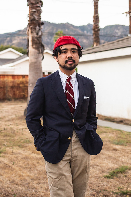
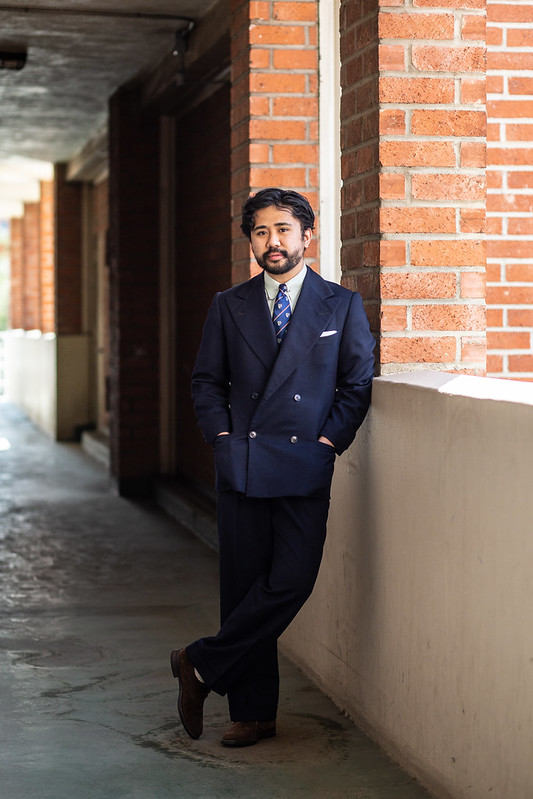
You might be thinking, “why doesn’t Ethan just wear a white one when he doesn’t want a pattern”, but I’m also very aware of the color expression of a white Pocket Square. Most of my shirts have some form of white (either as a base or a stripe), and so playing that up is not always my intent. White Pocket Squares also provide overly crisp (no doubt thanks to the Continental and Ivy looks of the 50’s/60’s) and formal (at times) air, which I don’t want in every outfit. I’ve also gotten used to wearing “non-formal shirts” with ties and suits such as work shirts or even dark button ups; a white Pocket Square would contrast too sharply and look odd. I also don’t think I need the additional expression of a Hank fold– I can leave my jacket breast pocket bare and let the other pieces exist as they are.
On that note, I’ve just come to enjoy suited looks sans Pocket Square. Yuppie looks, minimalism/tonal tailoring, and Frasier attire tend to hinge on not utilizing a Pocket Square. As those types of looks have been added to my canon, I simply forgo a Pocket Square. The same logic applies when I’m using the sportcoat as a jacket rather than something to tie a shirt and tie together. In that case, a Pocket Square just feels out of place and comes off as an attempt to make an outfit feel dandy when that isn’t the intention at all. There is a bit of gravitas and minimalist-leaning that comes with involving the absence of a Pocket Square.
For days I want to have a pop of color or pattern that isn’t from a tie, I’ll use a Jaunty Scarf or a Bandana. If I want to show off a tapestry or some kind of novelty print, why relegate it to a tiny part of my breast? A scarf or bandana is plenty fun and it adds the bonus of having that three dimensional effect that is reminiscent of a tie but just isn’t. I’ve written extensively about the Jaunty Scarf but maybe the bandana deserves its own limelight…
And who knows, maybe some day I’ll get back to that Drake’s/#menswear look and wear my patterned Pocket Squares again!
A look with an intentional vintage lean requires a pocket square.
A crisp TV fold helps emphasize ivy.
It’s also fun to wear even if there isn’t any white in the outfit!
A patterned Pocket Square works for when I want a more contemporary or Drake’s-themed looks (complete with a Drake’s pocket square).
It’s also #menswear. However, I find myself doing this less lately.
In general, a novelty Pocket Square can be fun to lean into when the mood strikes.
But there are also plenty of looks that are just fine without one. I do it when I want to focus on the jacket, shirt, and tie.
It mainly happens when I want to be tonal. The effect feels like. a fashion move.
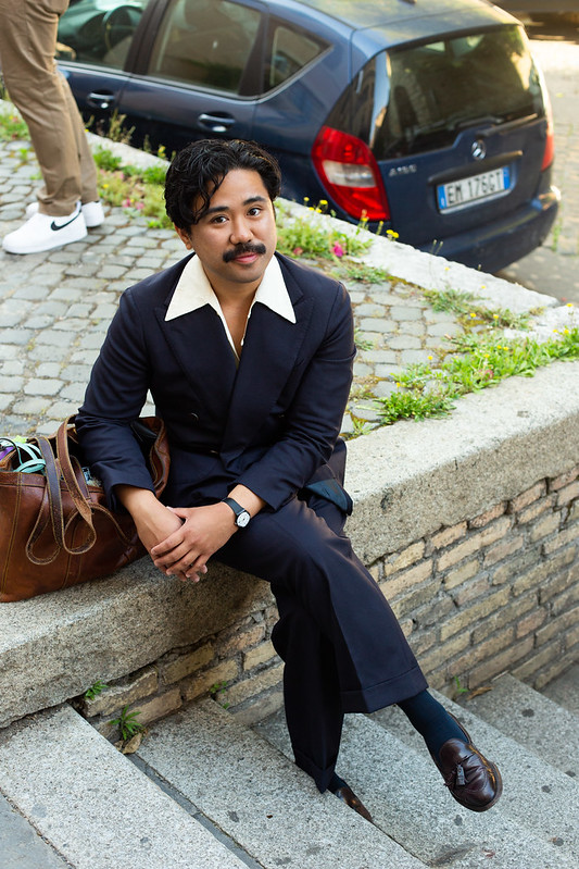
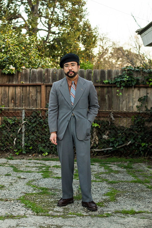
Or when the “character” I’m dressing after (like this 70s fit) wouldn’t wear a fancy little Square.
In the end, it’s all about what you want to look like and realizing just how important the inclusion (or absence) of a Pocket Square can play into it. Does a Pocket Square make sense for the POV you’re going for? Do you want to play up a certain color? Or does it feel tacked on as if its an obligation? Perhaps your outfit is perfectly fine as it is… or maybe you need that final pop to get everything right. It’s up to you!
It’s clear that we don’t think that a Pocket Square is a tailoring necessity. Guys can wear a suit (and tie) without it and it will be just fine. We also don’t think a Pocket Square serves as a replacement to a tie. In fact, we (or maybe just me) think that ties are more slouchy than not wearing one, simply due to the third dimension that it provides to an outfit. Some things are just more effective at achieving expressiveness than others, which is why a big part of menswear is recognizing those qualities.
The self invoked Classic Menswear challenge of choosing a Pocket Square lives on, just with more options to choose from. It’s all a part of the fun!
It’s funny to think how I haven’t officially talked about Pocket Squares on this blog when it’s very obvious that its inclusion (or absence) is something I invoke directly when making outfits. That’s why I also discussed this with Spencer and MJ on the latest Style & Direction podcast. Spencer and MJ have been big fans of patterned Pocket Squares and MJ in particular likes to wear them whenever he has a jacket (tie or not). We really get into the vibes of a Pocket Square and share our thoughts on when we decide to actually wear them.
You better listen to it after you read this!
Podcast Outline
09:11 – Intro
12:17 – History of Pocket Squares
23:26 – The Look of Pocket Squares
30:27 – Modern Usage
51:26 – Our Pocket Squares
1:21:32 – Wrap up
From Esquire’s Encyclopedia of 20th Century Men’s Fashions.
I love that the Golden Era was obsessed with Pocket Squares! Note how the Norfolk jacket has one (bottom right) while the brown checked jacket does not! Maybe Apparel Arts also invoked YMMV.
It seemed like men were to harmonize with their Pocket Square rather than explicitly match.
The exploding white Pocket Square was the move for the Golden Era all over the world.
Note that the man on the right is wearing a Pocket Square in his overcoat pocket.
A Pocket Square is ultimately optional, but it always looks just right for period looks.
The white Pocket Square goes with everything, grounding some of the wild combinations that you’d see in 1930’s tailoring.
I might be biased, but it always looked rakish and slouchy rather than overly formal.
Puff folds!
Apparel Arts cautioned against exact matching but you can find some advertisements that did that exact thing.
It does feel a little too studied or overly repetitive.
Echoing provides much better Harmony.
It doesn’t even have to be a color you’re wearing as seen in the use of this red pocket square.
Pocket Square in the overcoat again. It must have been a trend!
I guess this would be considered “floppy” and not “exploding”. Still very cool and slouchy!
I guess this would be considered “floppy” and not “exploding”. Still very cool and slouchy!
Referencing, but not matching exactly (note the Pocket Square pattern).
Solids in the PS and shirt but not an exact match.
This is a closer match.
AA also thought that mixing colors/patterns could be fun!
Those checked Squares were quite popular.
This combo feels incredibly contemporary.
A cool combo by Lucius Bebe (found in Dressing The Man).
Contrast, provided by the inclusion of a dark plaid pocket square that is exploding out of the pocket.
A flat lay that includes a Pocket Square option.
The 1930s-1940s loved those checked PS’s.
White Pocket Squares look nice with “formal” outfits.
Solids or patterned Squares feel sporty.
The two vibes in action.
A dark, patterned Pocket Square.
Walt’s use of the slightly exploding, checked Pocket Square feels quite 1930s. It plays along with the long collar, pinstripe suit, and wide brimmed fedora.
He adopted the TV fold in the 1950s when things got narrower. See how the Pocket Square plays along with the entirety of an outfit’s expression? It’s important!
Dark pocket square with some piping.
Slim TV fold.
Exploding plaid! Works with Jimmy’s knit tie and herringbone suit.
Those plaid Pocket Squares look good as a TV fold too!
An angled TV fold. Makes it a bit more rakish!
Gary Cooper uses the exploding Pocket Square in a jacket that has two breast pockets.
Gable loved his exploding Pocket Squares.
Just makes for an easy look!
It’s also a cool move with “formal” suiting looks.
Gary Cooper getting #menswear with a patterned Pocket Square in an exploding…puff fold? Sporty but elegant.
I…don’t know what this is, but. go off king.
Quadruple pattern mixing.
The patterned Square with a pinstripe suit! I wonder if this outfit was in my mind when I posted my take in the body of the blog post.
Astaire liked the exploding Pocket Square.
Crazy!
Lace is. a cool move.
One thing to note is that Golden Era guys wore Pocket Squares even if they weren’t wearing a tie! It was clear that they felt it just completed their outfit.
It does look quite nice, especially when it explodes a little. It provides a point of interest without using a necktie.
Disney again.
It does seem to upsell formality, even if the outfit is meant to be casual.
Bogey in a tweed jacket, air tie-ed sportshirt ,and a checked pocket square.
An iconic photo of Gable wearing a black polo and a bandana print Pocket Square. I guess when you don’t have a tie, the convention is to use your Hank as a pop of color.
Though I guess the 1960s did that with ties anyway. Note the slightly sloppy fold that feels like a cross between a puff and a TV fold. It all adds to the expression of the outfit!
Dark puff fold, referencing the dark stripe of the tie.
A Pocket Square wasn’t always worn…
Jimmy still looks sharp without one. It almost makes the outfit feel utilitarian and sightly minimalistic by removing the3D effect of a pocket square.
We get to enjoy all the pieces for what they are. It also makes a Golden Era Outfit come across as more contemporary.
Peak lapels and collar bars are “formal” but that doesn’t mean you must wear a Pocket Square.
Gable.
Gary Cooper (right).
Some 1920’s illustrations also forgo the Pocket Square. Makes everything look streamlined!
It’s very chic.
This outfit has a lot going on already, so it’s probably best that there wasn’t a Pocket Square (even a white one).
I do think it would look good here, but its a cool move to go without it.
Very “no nonsense”.
It also feels casual at the same time!
Let’s look at #menswear and Drake’s, who basically brought back the Pocket Square with their fun Hanks.
They went straight to providing pattern and color for guys to use. in their outfits.
While the pairings can feel a little “random” it works with #menswear’s maximalist (and fun) approach.
Being extra was the name of the game.
This also was the time when guys would use the Pocket Square in place of a tie. This meant that the Square had to be patterned and fun. Feels like a cop-out but it’s also indicative of an era.
If the Golden Era had the exploding white Pocket Square, then #menswear of the early 2010s had the colorful, patterned Pocket Square that they wore with everything.
It can feel a little cheesy…
But it also worked quite well. I like its use here, mainly because it provides pop since the shirt and tie are fairly standard.
It’s nice for sober outfits to have a bit of a buzz, even if it’s contained to the tiny breast pocket.
I actually really enjoy the patterned Pocket Square with a pinstripe suit.
Arnold does it well.
There’s also a bit of a rustic charm to these, especially since the #menswear Pocket Squares were made of wool-silk blends. A shiny silk would not be the right move.
#Menswear made Pocket Squares pop, but I’ve always preferred to use them to harmonize with the colors already found in the outfit.
Don’t get me wrong. The pop of color isn’t bad! In fact, I sometimes wish I was drawn to it.
I always prefer echoes or harmony.
This Square one really picks up quite a few colors in the outfit.
Bruce Boyer always accomplishes looking Golden Era and contemporary all at once! His Pocket Square choice definitely plays into that.
His use of a patterned Pocket Square doesn’t feel #menswear.
The Pocket Square is purple, which isn’t found anywhere else in the outfit but it still works amazingly.
It’s interesting to do a TV fold with a patterned Square! Most guys would do a puff or an exploding variation, but it’s so cool here. I may have to try this for myself.
Arnold Wong doing an exploding fun Pocket Square.
The bandana Pocket Square was a great move for this Esquire Man-esque outfit. It provides a pop of color while also making sense narratively for his outfit’s POV.
Aleks Cvetkovic in a somber look that has a hint of fun thanks to a patterned Pocket Square.
Chase of J. Mueser doing a similar move here.
I would be remiss if I didn’t mention RL. This is an expert use of a patterned Pocket Square.
Exploding, but doark.
Nguyen wearing a novelty Pocket Square with his white suit for a #menswear effect.
Yamamoto-San of Tailor Caid using a shiny silk Pocket Square in a solid dark color. Provides a somber accent to his rather lighthearted overall look.
The solid brown pocket square is a move!
A brown patterned Square in a puff fold with a burgundy blazer.
Akamine-san really going for some color here. I think it works!
MJ wearing a green bordered, tennis-motif Pocket Square. I love how floppy it is.
Even Ethan Newton (of Brycelands) gets in on the patterned Pocket Square business. It harmonizes and provides fun to an otherwise austere(ish) outfit.
The bandana Pocket Square plays along narratively with the denim shirt, while also providing a pop of color. A Pocket Square can do it all!
It’s also fun to see a Pocket Square worn sans tie in a fit that doesn’t feel like a realtor.
It seems that a Pocket Square is really meant for accenting rather than a formality thing at this point.
Drake’s really has helped sell that idea that you can wear a fun Pocket Square at any time!
It can be tough without a tie…
But there are ways to do it (like J. Mueser shows us).
Arnold Wong looks cool wearing a Pocket Square without a tie but that’s also helped by the other choices he’s made in his outfit.
Hector using a bordered Pocket Square to reference his bandana.
Michael using his as a pop of color.
Here are some of my novelty print pocket squares. Lots of greens, reds, and browns!
Vintage “deco plaid” Pocket Squares.
Again, don’t get it twisted: I still wear my patterned Pocket Squares from time to time. It’s done especially when I want to reference #menswear.
As I said before, I wore them quite a bit when I wanted to take breaks in between dressing in a fully period look. In other words, the patterned Square helped me be more contemporary.
Sometimes it was a little too contemporary.
I do think there’s a way to do it that isn’t too dandy or #menswear (though you would probably say otherwise).
Spencer always liked wearing patterned Pocket Squares. As he said on the pod, he likes the harmonizing and referencing effect it has.
He also had a small penchant for novelty print ones.
The yellow/cream Square really works with this dandier outfit, picking up a bit of the white in the check of the tie.
The Square is modern but it also feels delightfully Golden Era in how Spencer wore it.
He was always a master at harmonizing.
I occasionally wore Patterned Pocket Squares with period attire.
But as time went on, I really used them when I did my contemporary ivy-prep/Drake’s looks. Again, it was all about differentiating the expression in my POVs.
Even though I’m wearing a spearpoint collar, the outfit should learn more “modern”. The patterned Pocket Square that contributes to all the patterns helped with that!
I guess that my use of “pops of color” really help place this outfit in the more #menswear phase of my attire even though I’d wear something similar to this today (but sans Pocket Square).
These Squares are indeed fun and I’m sure I’ll come back to wearing them often soon enough.
They really helped me dress “Drake’s” which had a distinct look I wanted to reference with my attire.
They really helped me mark my outfits as fun and contemporary!
What I also think is telling is that the Pocket Squares were the most bold part of my outfits!
That being said, I still wore fun ones even when I was doing something more “Brycelands” or rugged where a Pocket Square may not have made sense narratively speaking.
I still dip into it…it’s just rare now. It also leans more “trad” than it does 2017 Drake’s/#menswear (though perhaps it still does lol).
And while I don’t typically use it to echo my tie, I’ve found a bit of fun in invoking that effect…on occasion (like the outfit above). It’s not something I’ll do often.
In fact, through writing this article I got inspired to break out some of my old favorites and make it work within my current approach to menswear (not that it’s that much different).
And it’s fun to wear a patterned Square, especially with full suit.
It’s nice to contrast.
And play into the colors of the fit. On occasion of course.
While patterned Squares are fun, nothing beats the gravitas of the white Pocket Square.
The effect is emphasized with a crisp TV fold just barely peaking over the breast pocket. It’s streamlined, rather than “fun”.
Despite it being a core tenet of the midcentury ivy look, the TV fold comes across as crisp, professional, and formal.
While it is a core tenet of an intentional midcentury ivy look, the TV fold simply comes across as crisp, professional, and formal.
Doing it in a “pointed up” or exploding variation trades the corporate vibe for rakishness.
Dick Carroll does a telescoping TV fold with an ivy ensemble. This added dimension adds to the expression.
Compare that to this one, where the TV fold is just barely peaking out.
It looks really good with dark suits and white shirts.
It also adds something to a checked shirt. The contrast in “perceived ” formality is fun!
I like it used here with a flannel suit, denim shirt, and moc boots. It adds just a sliver of perceived formality despite the “casual” accouterments.
Matt Woodruff of J. Mueser using a black-bordered TV fold to great effect with his grey suit and striped shirt/tie.
Chase likes wearing a white Pocket Square even if he’s wearing jeans. It’s more about the effect of the white Pocket Square with his jacket/shirt/tie combo than about formality rules.
Compare the hint of a Pocket Square to no Pocket Square at all.
Ralph Lauren knows that the white pocket square (in a slightly exploding fold) is essential to its references to Golden Era menswear.
Akamine-san uses the white Pocket Square in a slightly askew TV fold to invoke a bit of mid century charm.
Just a hint of an exploding Pocket Square.
We can’t deny that this white Pocket Square (as well as his overall pairing) helps point his outfit to a vintage vibe.
Mark Cho does the same thing! He’s not inherently a vintage guy, but his outfits are always helped by his Pocket Square choice. I jsut love the tiny exploding Pocket Square.
A neater and more precise variation worn with a 50s style Caid suit.
Even if you don’t read these as vintage, I think you can at least say that they look rather rakish thanks to their exploding white Pocket Squares.
Bruce Boyer uses the white Pocket Square to great effect. It’s certainly a contrast to his sporty outfits that use his patterned Pocket Squares.
It ‘s key for evoking that Golden Era charm, at least to me.
Arnold Wong uses the Exploding Pocket Square to great effect.
Doesn’t it just correspond to the slouchy vibes of the outfit?
Akamine also wears a white square even if he isn’t wearing a tie. There is a charm to doing it this way as it really does “dress up” a tie-less fit.
Kamoshita-san doing something similar but even further dressed down.
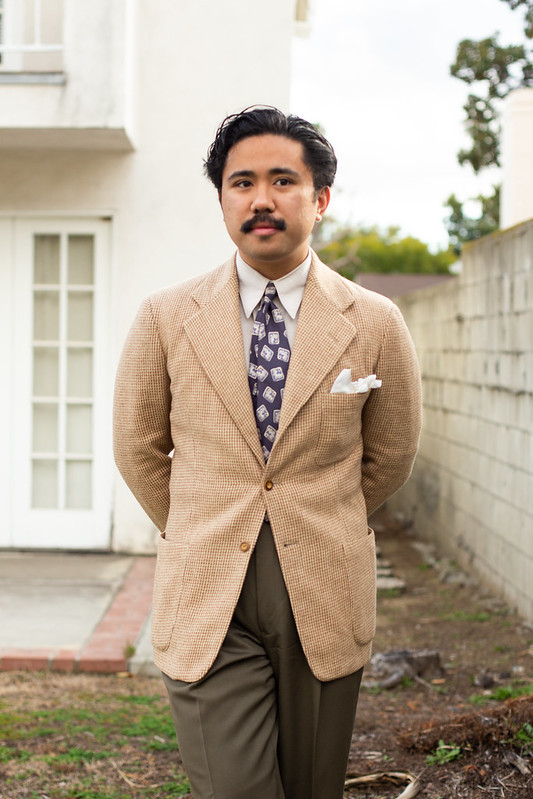
As I said before, I mainly wore white Pocket Squares and it was almost always in service of a specific look. I’m using the exploding Pocket Square to evoke the 1930s in this fit; I’m also wearing true vintage clothing.
I did it quite a bit. I have no regrets!
It really helped contribute to my look because I was cognizant of its expressive properties.
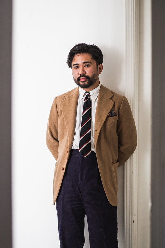
It wasn’t always about the 1930s. In the above, I’m going for ivy with a slightly askew TV fold.
Spencer using a semi-exploding Pocket Square with a 1940s take on ivy.
Similar effect here! The whole outfit is ivy, but the Pocket Square gives it a bit more character than the prim-and-proper TV fold.
I wore the white PS a lot. It wore it with regular outfits…
…and ones where I wanted to play up the formality.
Spencer always used his Pocket Square to express a vibe. This was taken almost a decade ago!
As I did more ivy-adjacent looks, the exploding Pocket Square was more of a personal reference to my love of 1930s styling. It’s also slouchy!
Of course, I always brought it out whenever I was explicitly doing a period look.
I also felt that a white Pocket Square helped “equalize” whenever I had a lot of patterns (and colors) going on.
I oddly felt like it helped me out whenever I wore a bowtie. it might have been extra, but it’s fun to lean into it.
Again, a white TV fold pocket square just makes sense if you’re doing (or just referencing) ivy.
It helps reinforce the idea that you want to look clean and presentable even if your attire is on the “casual” end of classic menswear (sweaters, corduroy, Paraboots).
That ideas is played up even further here with a beanie and wrinkly WWII chinos.
It really helps calm down a bold fit.
It can also lean into the austerity of English trad.
Or help remind people that you are doing ivy…even if you’re wearing flares.
Or that you’re doing vintage, but more mid-century than Golden Era.
The Exploding Pocket Square is for the Golden Era-inspired fits.
I’ve kept it alive even as I’ve moved to mainly wearing contemporary jackets.
It’s not enough to wear long collars and vintage ties. The white exploding pocket square really helps emphasize the look I want.
I can’t imagine doing this type of look without it!
I also it just makes sense expressively, echoing the wider lapels, long collars, and big pants. It’s more than just providing a pop of white!
This one feels more era agnostic, but I think the Exploding Pocket Square helps place it firmly in a Golden Era theme.
It can even make an Ivy fit a bit more jaunty (or slouchy).
Leaning fully into it is something I’ve been doing lately.
I even do it with a white suit!
Or when there’s a lot of Dark colors. I think it would be a much different outfit without the white pocket square.
I also like using the exploding pocket square in outfits that seem more “buttoned up”. It adds some slouch!
Full send!
Removing the Pocket Square would’ve been a cop-out.
Even when I don’t fully send, it still helps.
Works with more contemporary-passing vintage looks…
..as well as ones that are decidedly vintage (just look at that tie).
Its just fun to do, whether in how it interacts with the colors of your outfit or how its folded.
It’s not always exploding fully out of my pocket…
..but sometimes it is.
I’ll do it even if my shirt isn’t a dress shirt.
I guess here it’s less about period accuracy and more so…I just like it.
And even though the white Pocket Square can lean “vintage”, I also like it with contemporary pairings too.
I’ve also done it sparingly when I haven’t worn a tie at all.
It wasn’t bad, but I started to question why I had it there to begin with.
Spencer used to do that quite a bit when his casual style leaned more vintage-tailoring (i.e, the less rugged Spencer than the one we know today).
That’s because in the end, not wearing a Pocket Square is cool too!
Jake Grantham (and most of Anglo Italian) go sans Pocket Square quite a bit and it looks chic and somber, something I’ve also been trying out.
Jake Grantham (and most of Anglo Italian) go sans Pocket Square quite a bit and it looks chic and somber, something I’ve also been trying out.
It feels more like “fashion” than it does simply looking professional. There is an intentional vibe at play.
A Pocket Square might have been a bit too extra for this rig with a cricket sweater, so forgoing it helps make it serious.
Barely a Pocket Square in sight.
When you’re already going bold (like this J. Mueser combo), you may not even need a Pocket Square to begin with!
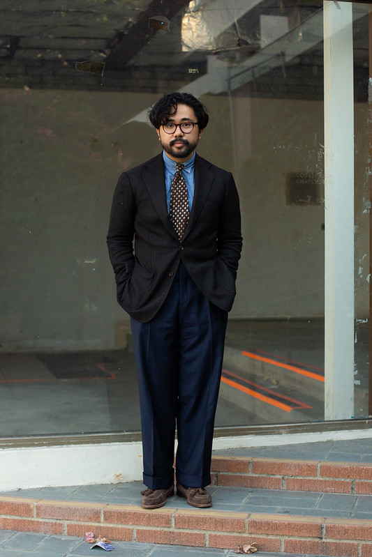
Chase. I think including a Pocket Square here would’ve been too attention calling or distracting as the whole point is how the jacket works with the shirt and tie.
Matt Woodruff of J. Mueser. Going sans Pocket Square helps keep all the tones in the suit, shirt, and tie from being interrupted.
Works really well when the styling leans tonal and minimal.
Case in point!
A bandana or neck scarf is probably the better choice if you need to add an accent.
Bruce has always known.
In any case, forgoing the Pocket Square helps us focus on the tailored jacket as a jacket not as a garment that people normally wear with ties.
Even Drake’s knew when a Pocket Square was going to be overkill.
Even if you’re not wearing a patchwork madras jacket, it’s fine to simply let your shirt and tie lie without any additional harmonization in the form of a Pocket Square.
No pocket square? That means its just a jacket with pockets and lapels!
A Pocket Square would look incredibly out of place here.
When you go for the in-between looks like this Anglo-italian one above, I could take it or leave it. But I will say its probably best to go sans Pocket Square so you won’t feel like you’re being “fancy”.
It’s nice to let the jacket exist on its own with no pop of color coming out of the breast pocket.
It especially helps if you intend to be minimalistic (especially without a tie).
Even if you do wear a tie, it makes the sportcoat come across as a chore coat with lapels (The Armoury).
And in some cases, it may help to prevent yourself from going too far into a vibe. While Ethan Newton takes some cues from the Golden Era, he might realize that a pocket square worn with a club collar and a fedora may be too much.
It’s still vintage-leaning but its a mature take.
Sometimes you just don’t feel like wearing one and that’s okay!
Replacing a Pocket Square with a Jaunty Scarf is quite an expert move.
It’s always your decision on if you want to wear one or not. Wearing a Pocket Square does change up the vibe, even if its in a small way.
Armani was quite adept at forgoing the Pocket Square. It helped make the Yuppie look (as well as general 80s and 90s suiting) quite distinct from the eras htat came before.
As I said before, it makes for a fashion-leaning vibe.
Frasier didn’t do it.
For me, it usually helps if I make an outfit that doesn’t need a Pocket Square to begin with. I’m referring to when I wear a tailored jacket with a shirt that doesn’t involve a tie.
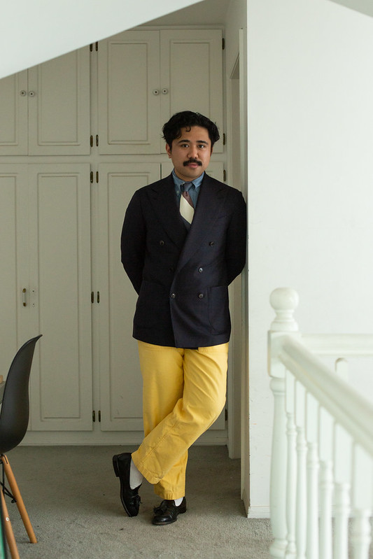
A Pocket Square wouldn’t make sense with this outfit. I also wore this to the club, which would’ve made a Pocket Square even more out of place.
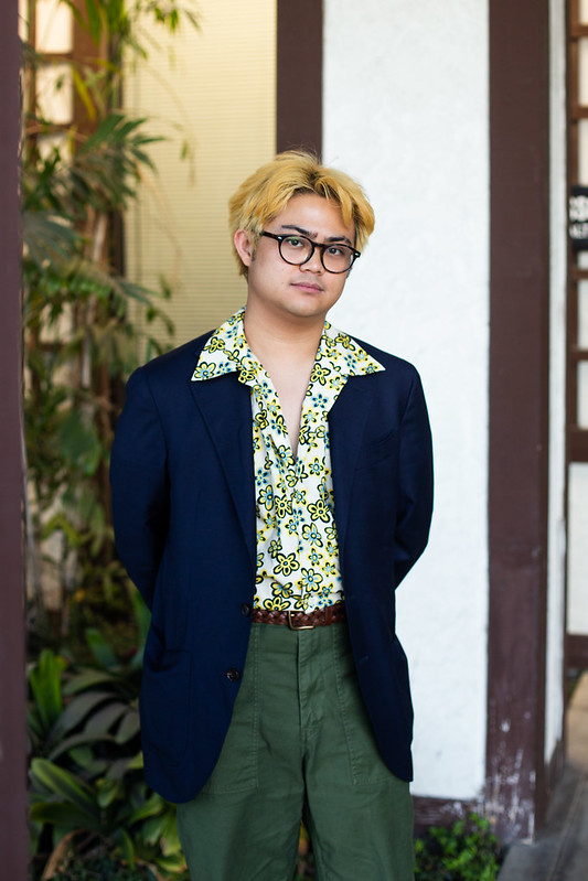
I don’t think a Pocket Square narratively makes sense with an aloha shirt and military fatigues. Again, the point is that we need to treat the sprotcoat like a jacket with lapels. Going sans Pocket Square helps that!
This is a full suit, but I still think a Pocket Square wouldn’t work here.
This is almost built on not wearing a Pocket Square.
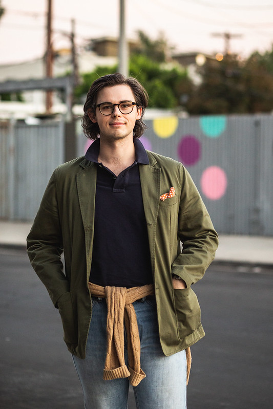
I didn’t want any Pocket Square to detract from the fun shirt and fair isle combo.
Not needed here for this look.
Not here either!
I like the restraint when I forgo a Pocket Square even when I wear a tie.
It’s almost as if you’re intentionally not doing a formal look but that you’re wearing a lapeled jacket and pants and a tie.
Of course there are also the times where a Pocket Square might be overkill.
But most of the time, I like keeping things fairly minimal and letting the only patterns and color be found in the triangular sliver where my shirtand tie reside.
While I feel like I do the same pairings I’ve always done, the decision to not wear a Pocket Square is something new to me.
It may even define my approach to tailored outfits post-pandemic.
MJ has been doing it too!
It’s almost like I’m wearing the same types of outfits I’ve always done, just without a Pocket Square.
I do recognize that some of these looks are ones that involve a dark shirt.
It’s been especially pertinent the more I full send vintage-inspired outfits. Sometimes I’ll choose between the exploding Pocket Square or wearing a hat; there are just some days wher I don’t feel like doing both.
Maybe I actually don’t want to full send.
Sometimes I just want to let my wild ties be the full star.
Or my outfit is wild already.
Or I want to lean on a very minimal and tonal palette. That means absolutely no novelty prints or a white Pocket Square.
Or maybe I want to exude gravitas.
Maybe a cowboy in a suit wouldn’t want a fussy Pocket Square.
Maybe I want to get a little Anglo-Italian.
Because I do think that in some cases, even a white Pocket Square would be distracting.
I do tend to not wear Pocket Squares when I wear sneakers. It just doesn’t’ make sense narratively.
Or I just don’t feel like wearing one.
Even if it would be just fine if I did.
Most of the time, I go sans Pocket Square because I want to exude Frasier/Armani core where a Square is not a part of the look.
If I actually want to have a pop of color, I’ll just wear a Jaunty scarf or a bandana.
I will say that one place I will most often wear a Pocket Square is with black tie.
There is precedent for using a fun Square in evening wearing but I prefer keeping it white/cream.
That being said, I’ve forgone the Square even in Black Tie. It’s usually because I’m intentionally dressing down.
Spencer does this move as well.
In the end it’s all about figuring out if your outfit “requires” a Pockets Square as a part of its POV. It’s fine if it does!
It’s also fine if it doesn’t. The choice is yours!
Thanks for listening and reading along! Don’t forget to support us on Patreon to get some extra content and access to our exclusive Discord.
It seems like we got a considerable picture dump in this post, Ethan ;P
Personally, I tend to wear a pocket square only when I am not wearing a tie.
I am very aware of how easily a pocket square can be added to most tailoring, especially when contrasting in Patterns a la Duke of Windsor.
I just find it gets too busy, and I end up feeling a tad silly. That said, when you rock it in the pocket, you easily add much-needed colour to an outfit.
Further, if you find yourself wearing a pocket square in my usual haunts, a rowdier pub, or a nightclub, you will find a pocket square missing in seconds.
They are so easily snatched in passing, and I have lost my fair share as a result.
I think a pocket square adds a lot to an outfit for relatively little trouble/cost/inconvenience.
For the life of me, I just can’t understand people who overthink this.
that’s true! but i also don’t think that every outfit needs a Pocket Square. It’s like how not every outfit works with a fedora or a collar bar! It’s not a big thing to think about it but a fun consideration to have when making an outfit!
Absolutely. I was thinking more in terms of some of the handwringing, by some people on the net, about it being “correct” or otherwise or being “too much”…


It seems like we got a considerable picture dump in this post, Ethan ;P
Personally, I tend to wear a pocket square only when I am not wearing a tie.
I am very aware of how easily a pocket square can be added to most tailoring, especially when contrasting in Patterns a la Duke of Windsor.
I just find it gets too busy, and I end up feeling a tad silly. That said, when you rock it in the pocket, you easily add much-needed colour to an outfit.
Further, if you find yourself wearing a pocket square in my usual haunts, a rowdier pub, or a nightclub, you will find a pocket square missing in seconds.
They are so easily snatched in passing, and I have lost my fair share as a result.
LikeLike
Wow! Thanks for sharing! I’ve never lost a pocket square before, thank goodness!
LikeLike
I think a pocket square adds a lot to an outfit for relatively little trouble/cost/inconvenience.
For the life of me, I just can’t understand people who overthink this.
LikeLike
that’s true! but i also don’t think that every outfit needs a Pocket Square. It’s like how not every outfit works with a fedora or a collar bar! It’s not a big thing to think about it but a fun consideration to have when making an outfit!
LikeLike
Absolutely. I was thinking more in terms of some of the handwringing, by some people on the net, about it being “correct” or otherwise or being “too much”…
LikeLike