
I used to think that I didn’t have a real philosophy on how I wear color. I just picked what I liked and used it to evoke certain style aesthetics. And then I realized that is a philosophy!
Before you start reading, listen to this podcast episode! It’s a good listen that sets up the rest of my essay and the photos I’ve included. Our faithful patron Eric (who suggested this topic) was also kind enough to write us this guide, which helped in the first half of this pod! We aren’t color scholars ourselves, so we took him at his word.
I remember the days when I first introduced color to my menswear wardrobe. No, it wasn’t about ties, socks, or pocket squares, but shirts. Mind you, this was during the days when suits were navy, black, and grey, with no room for checks or separates. In other words, I dressed like I was going to prom (even though my Christian high school didn’t have prom). For a long time, this was the extent of how color and fashion worked for me. It was basic, with simple color swaps meant to stand in place for actual interest or taste.
I’m not sure how I grew out of it, but it must have been quite early, as I went from that prom look (and a brief period of #menswear) to jumping into period clothing, culminating in my vague form of classic menswear. In retrospect, I had [fortunately and amazingly] skipped over a lot of the oft repeated color rules that you see across blogs and youtube videos. No Brown in Town. Black is for funerals. Red signifies power. I’ve said it plenty of times before, but it’s pretty sad to see how many guys are beholden to these old notions of color and menswear. It’s not even used in the “type” of menswear that my friends and I practice; though obviously thanks to the amount of normies non-menswear people, these color ideas still persevere.
We still hear that oft repeated suggestion of “adding a pop of color” in many a menswear blog and youtube. Most of the time the pop is a too strong, done for attention and contrast, rather than for a deeper meaning pointing toward an aesthetic. Tailoring is seen as “formal”, which often means that it should be boring- bar that pop of color (which could be as subtle as a pocket square or a vibrant as a satin tie). After all, color is often used in the place of personality or true subversion, where specific pieces are involved to subvert the vibes of the root outfit. They aren’t there yet, though so all they can rely on is color.
I don’t blame them though. As Eric points out in his notes, color can represent a lot of things. I suggest you read it (if you didn’t do so at the top of the post), but it basically points out how many of the non-earth tone colors we see today are novel. Purple, yellow, and orange were historically difficult to create. As a result, the use of colors signify luxury and in some cases, royalty. Obviously dyes became easier to produce, but these colors have retained some of their social and cultural connotations. For example, red is tied quite heavily to royalty, from the capes worn by kings to the Red Carpet or the bottom of Louboutin shoes. I could be wrong, but I think people think about how colors play into perceived aesthetics, rather than to try and evoke a certain emotion. (Or maybe those two ideas are the same thing)
For me, color is rooted in aesthetics, just perhaps removed a bit further from those social connotations. Certain menswear vibes and outfits use certain colors (in various shades and hues). As a guy who dresses based on a POV or a desired aesthetic, this is where color fits in. IThere are some basic color ideas that that I like to adhere to. Navy and grey are corporate. Black is edgy. Browns and other earth tones are casual. Other colors like yellows, purples, and oranges are for fun. But as you’ll later gather (and see in the photos I’ve included), these ideas are quite loose.
I’m sure that deep down, I have some sort of internalized rule about what works for my skin tone or how some colors can feel “aggressive”, but the defining factor is how colors tie into the specific look that I’m doing. Some colors are just more conducive to certain fits than others- I’ve probably turned this into a micro decision when buying clothes or crafting outfits. In other words, I don’t think that I spend much time thinking about clothing that much, since it’s just…inherent in my closet already.
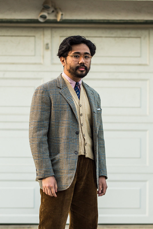
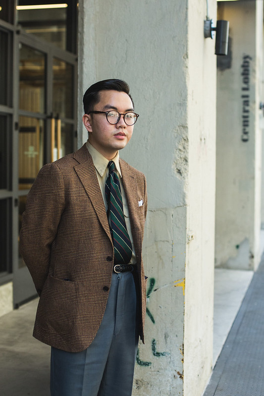
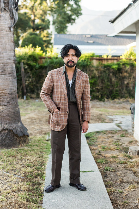
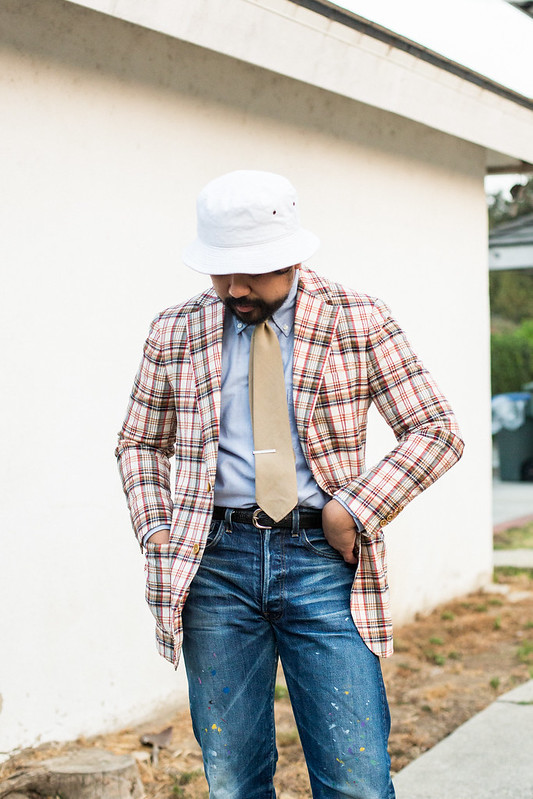
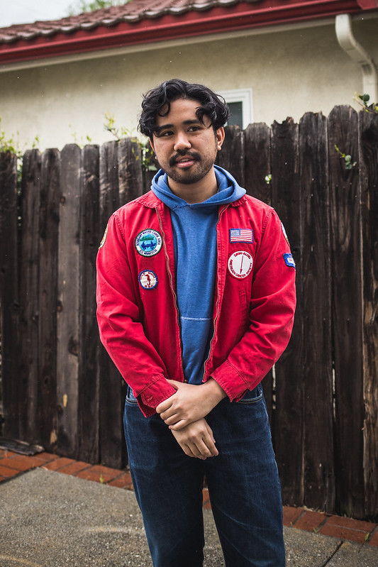
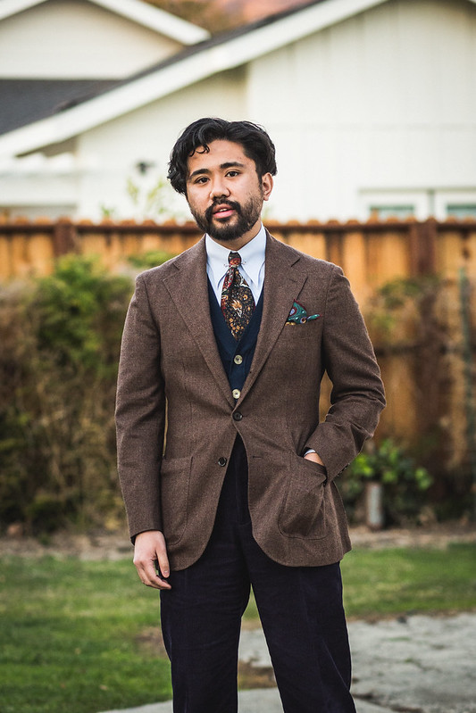
As you know, I look at historical attire from the 1920s-1970s as a source of my inspiration, both for vintage and contemporary outfits. And as you might have guessed, color plays a big part in characterizing the aesthetics of the decades contained therein, connected not only to the cloth but certain pieces. For example, the Bold Era/Post-WWII look embraced vibrant colors, usually in conjunction with crisp wool gabardines that flowed nicely when dancing. This was a contrast to the more muted colors pre WWII, though to be clear the 1930s were vibrant as well- just in a different way (more earth tones and plaids). Even the ivy era was full of color, with red blazers and GTH pants being a popular choice for casual trads of the early 60s, before utilizing more flecks and browns later into the 70s.
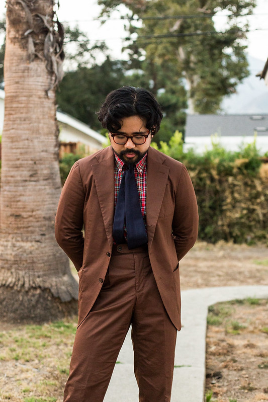
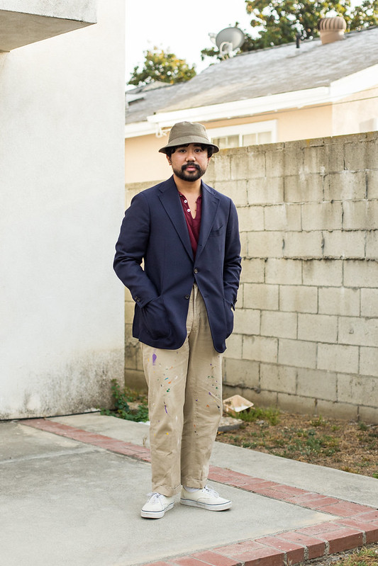
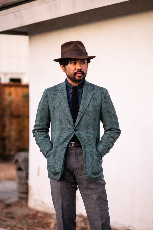
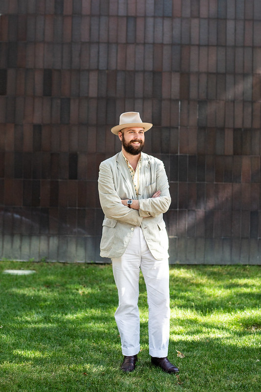
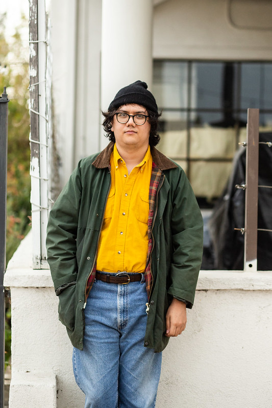
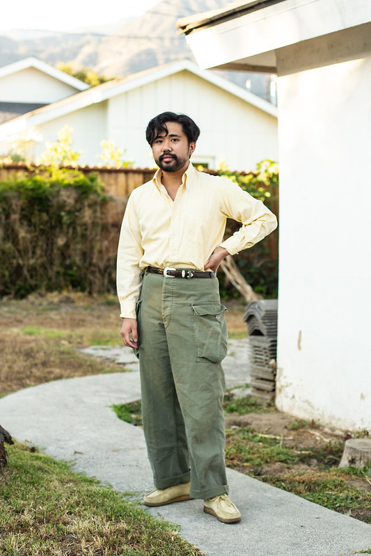
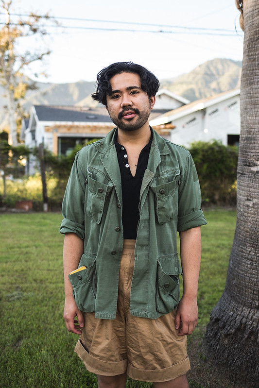
Even in broad terms for classic menswear, where you don’t necessarily want to dress like a certain era, color can still play a role depending on your POV. Corporate attire tends to lean heavily on blues and greys, which to me reference the rigidity of military clothing (the roots of the suit). We can even expand this to city attire, where cold colors can echo the skyscrapers and man-made city life. Alternatively, country attire and sportswear (non-business clothing) leans on earth tones, most likely to reference how browns and indigo blues were seen as “working class” or casual; it could also just be used to reference more of nature, as tall metal buildings are absent from this setting.
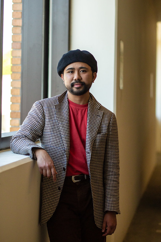
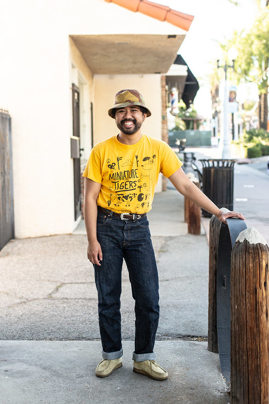
Of course the easy way is just to signal that you’re not dressing for formality. For most people wearing classic menswear, formality is the guiding force, which results in a lot of color-less attire: black suits, white shirts, minimal ties. However for menswear enthusiasts, color is a bit of cheat code to show that you’re having fun with clothing. You don’t need to dress “boring” because you don’t have to be. This is probably why a iGents start out with fun socks, but as they turn into more discerning menswear enthusiasts, you start to see them play with color across jackets, trousers, shirts, ties, and knitwear. The best ones are done in conjunction with casual details and texture, but overall, it’s just about having fun. It’s jauntier and artistic. Think of it like those 1960s modernist art paintings that make use of vibrant color. They could be more restrained, but they decided not to- even if its a bunch of shapes on a canvas.
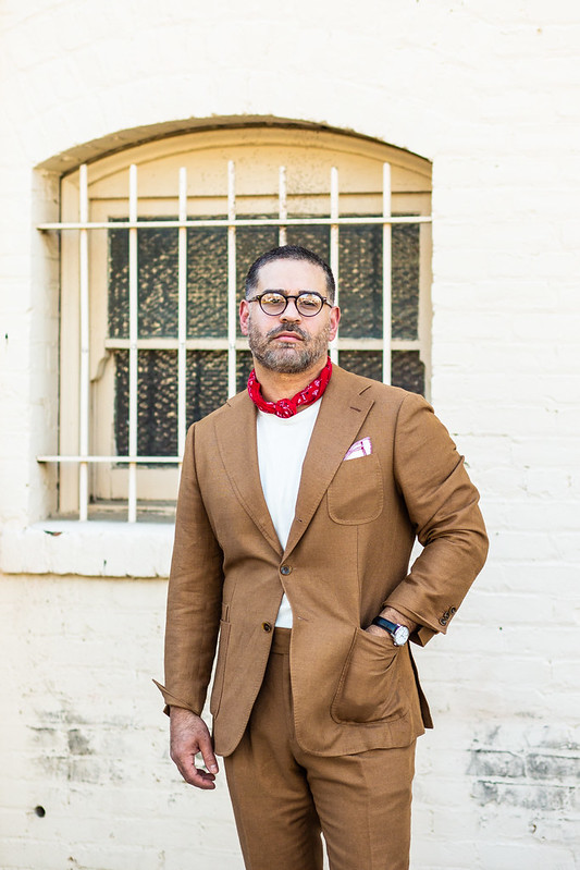
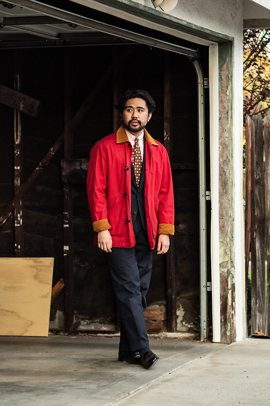
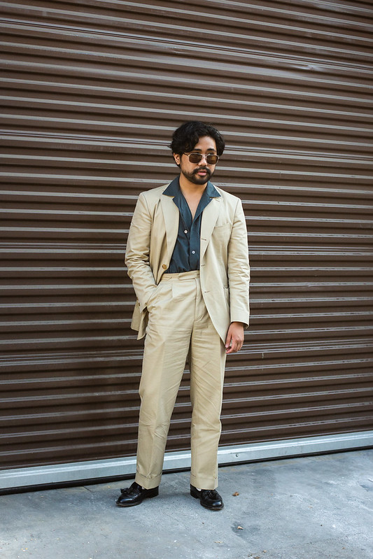
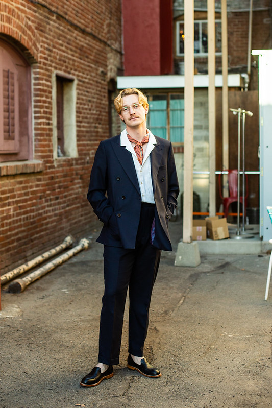
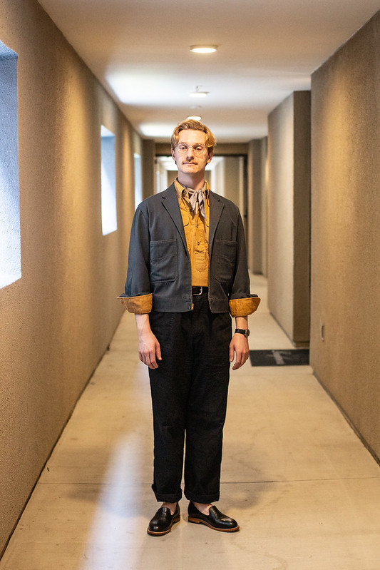
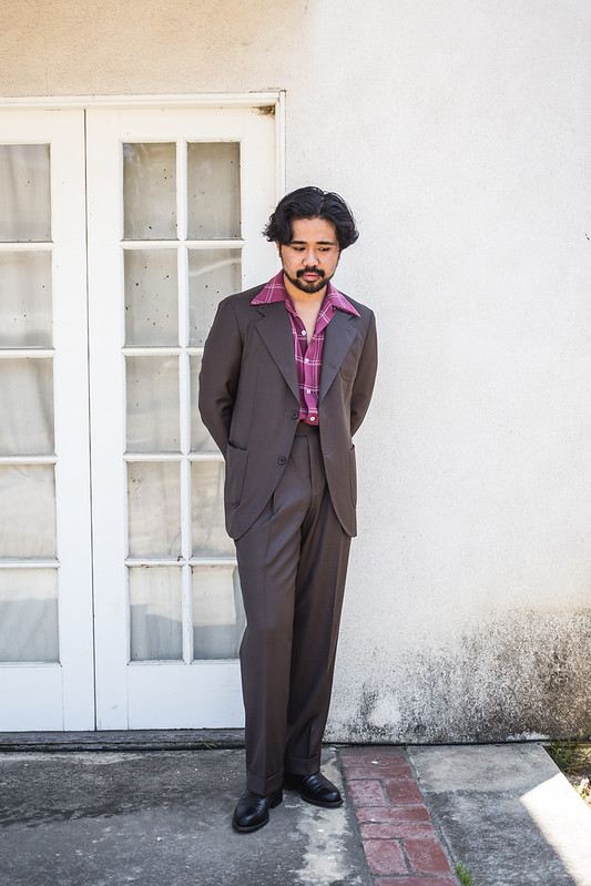
Now thanks to the many components of tailoring, color can be played with or subverted in varying degrees. For example a country brown suit could be made a bit more “city” with a sobering black crunchy knit tie; a sold navy or black repp would evoke this sleeker look due to the literal smoothness of the silk, playing into how texture can also play a role of subversion with color. Or a charcoal suit can go against the typical corporates connotations if worn with a fun foulard; the use of a soft yellow shirt or a vibrant Bengal can further that action. It’s also up to you whether or not you want to envelop loud colors with solid tailoring or break it up with separates.
The more I write about this, the more I realize just how color plays an equal part in my tailoring choices, even if it is quite internalized. After all, even certain patterns just look better with color, using contrast (bengals) or doing something tonal (like a tonal seersucker or plaid). I’ve even highlighted this in previous essays, like how GTH utilizes color to make something boring more “fun” or how jewel tones can be awkward to wear unless done in corduroy ( I’ll admit that this isn’t always true).
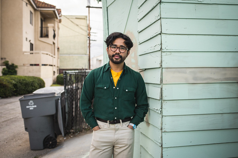
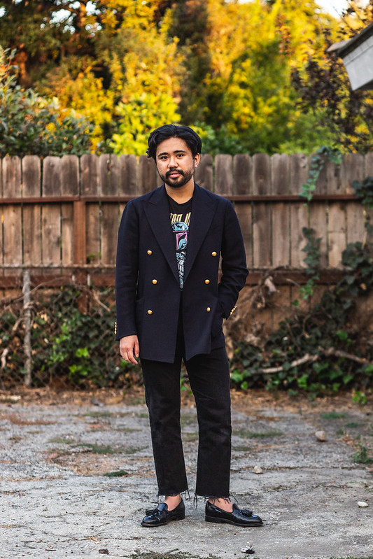
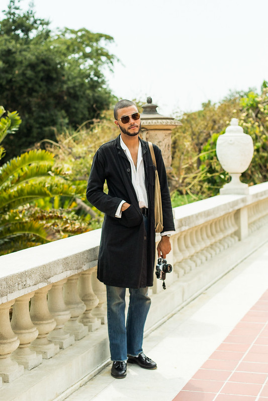
I also noticed how much I use color to evoke the ideas of other garments. You guys know that I’ve always said that a navy sport coat is just like a chore coat- they’re both a blue jacket with pockets. Using color as a common ground helps make their versatility (and practicality) much more palatable, providing even more context behind my theory of casual alternatives to tailoring (and fun pants). Olive military chinos are easy to wear since they’re just like a regular pair of green wool flannels. A chambray shirt, a blue OCBD, and a denim sawtooth are quite interchangeable with my style, guided only by what POV I have for that particular day (though there is obviously a throughline).
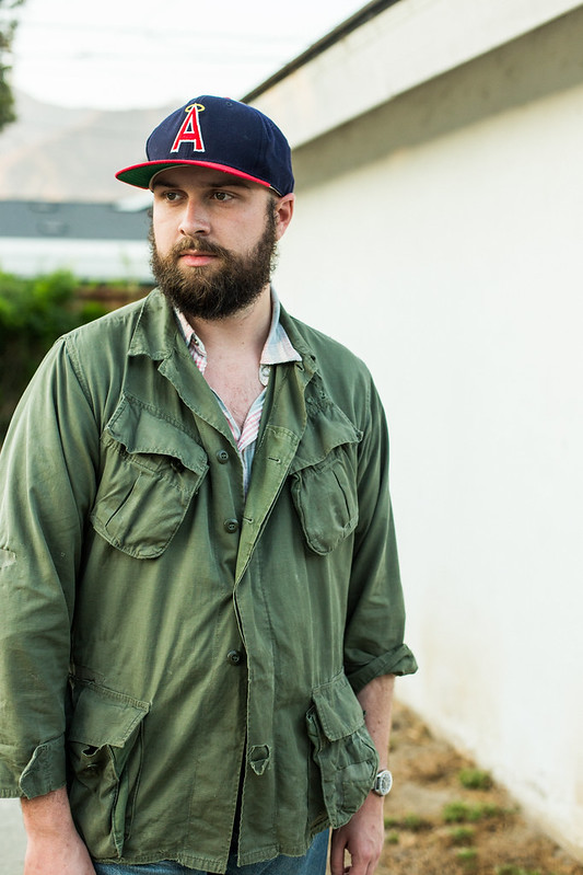
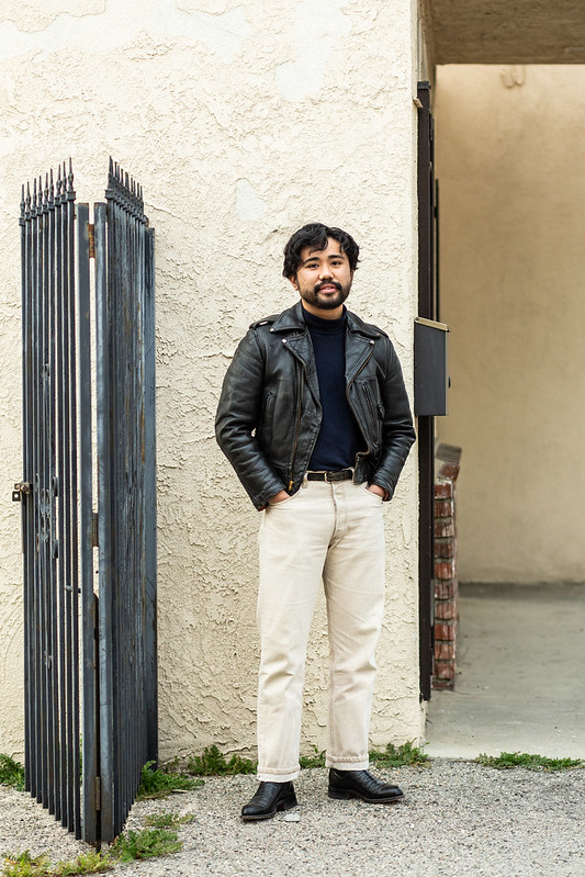
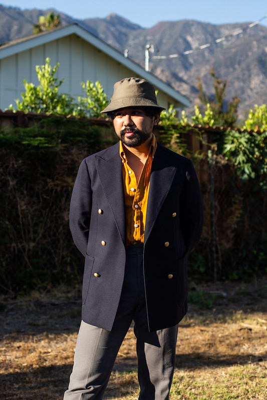
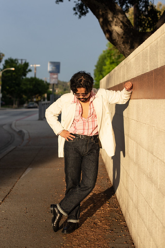
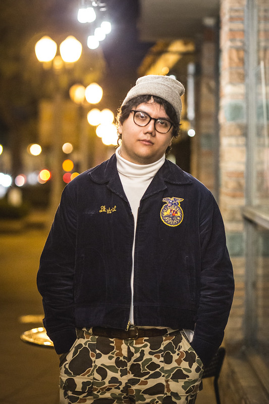
Subverting is also a cool move, which is why vibrant colors for milspec, workwear (which includes chore coats, workshirts, and work pants), or overcoats are also quite a move to do as those pieces are traditionally quite muted. There’s a bit of dandyness (bordering almost on safety/caution clothing) involved in the mindset, but that’s one of the ways to signal an intentional POV. Now that I think about it, the color doesnm’t even have to be vibrant- dull power blues or pinks look quite interesting on chore coats or trousers. The entire idea about using color on “regular” menswear is a bit similar to my GTH mentality, which is rooted in how I’m able to mix a few pieces that stodgy guys would say doesn’t work with the ideas of “classic menswear”. Though as we know in Esquire, the 1930s had a variety of cool clothes in a variety of colors (they even had leather jackets in different colors)- the precedent has always been there. They even did the dark shirt + tailoring look before teenagers at H&M ruined it.
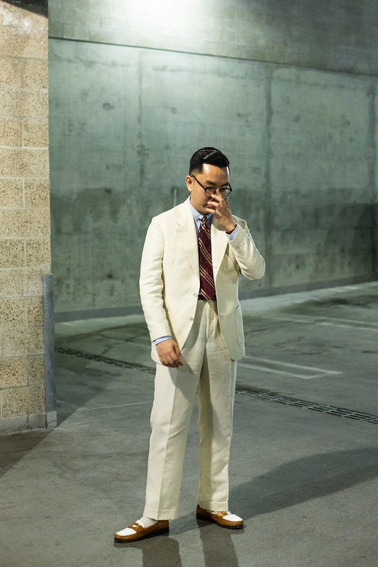
Now that’s not to say that going all in for pop or dressing to emphasizing a particular color is a bad thing. Well dressed men have done it for ages, across all eras. Usually most of these involve more casual outfits, such as wearing a vibrant red westerner (instead of the classic indigo blue) with black jeans. It just depends on what vibes you want to create. Want something normal? Stick with navys and greys and muted versions of typical clothing. Want to go fun? Inject color into it. Or, as you guys remember from last year, if you want to go edgy, add in black. Or go for black in all of it. It’s always going to go for the vibes you want to creat from your outfit. And with a vague notion of menswear, you don’t have to worry about how formal or casual it is because chances are, your outfit will have a little bit of both.
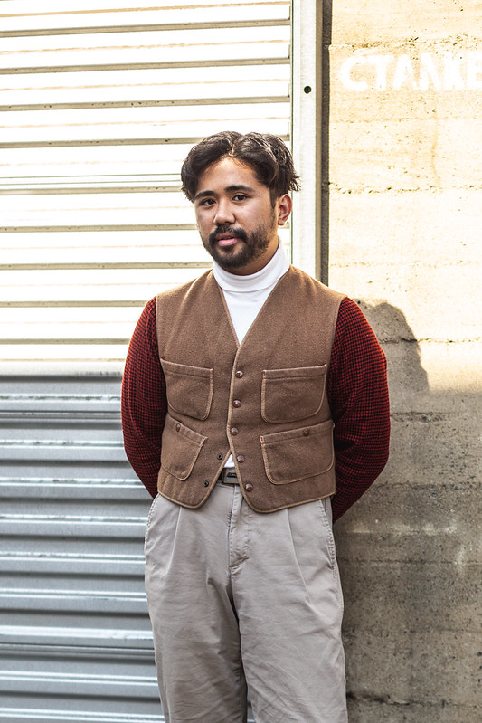
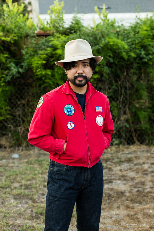
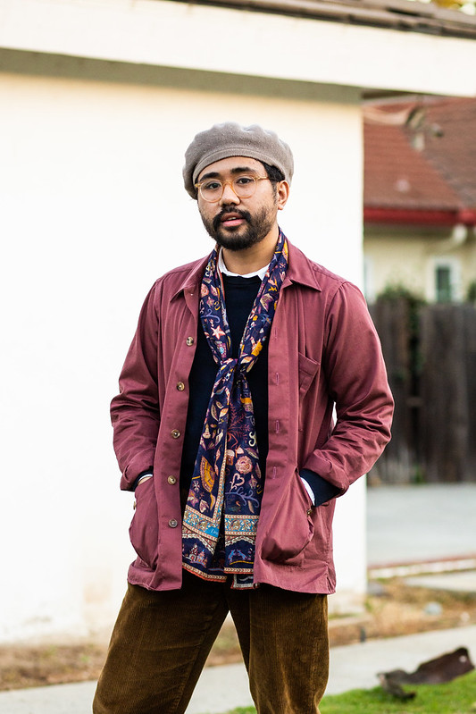
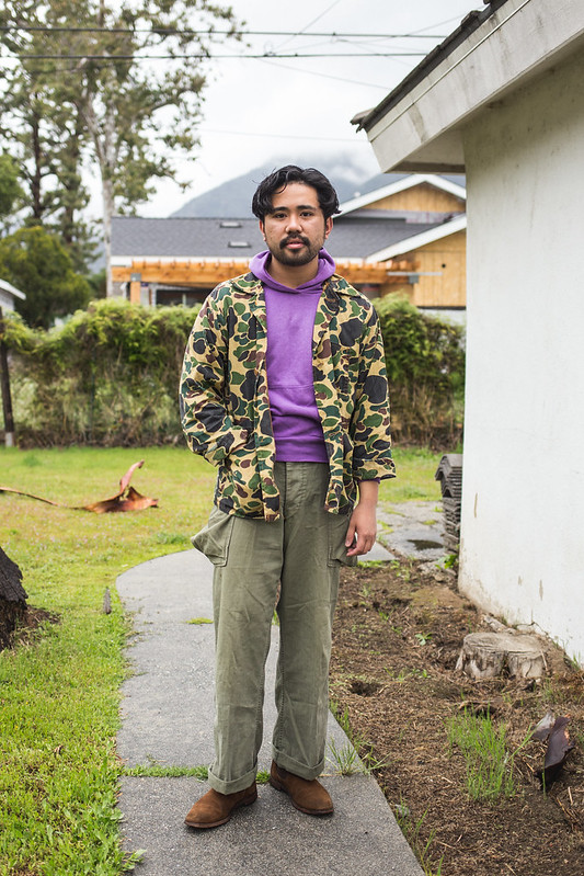
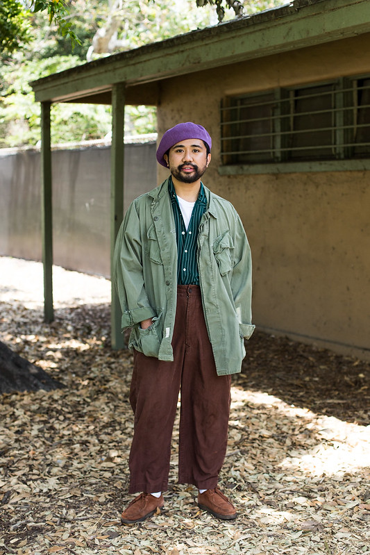
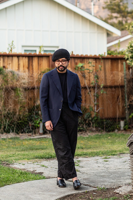
Even if the outfit isn’t inherently casual, color still seems to work best with “casual” pieces (non-tailoring), ranging to small accoutrements like beanies and berets to larger things like a Cassentino overcoat, a wonderfully plaid mackinaw, or a saturated barn coat. With that said, I do like the idea of injecting color within tailoring. For a while, that came in the form of having fun with socks, where the saturation on a small piece of hosiery was justified. Who doesn’t want to feel like royalty by wearing red socks or to feel like a jaunty huntsman with a bit of yellow peeking out between derbies and cords?
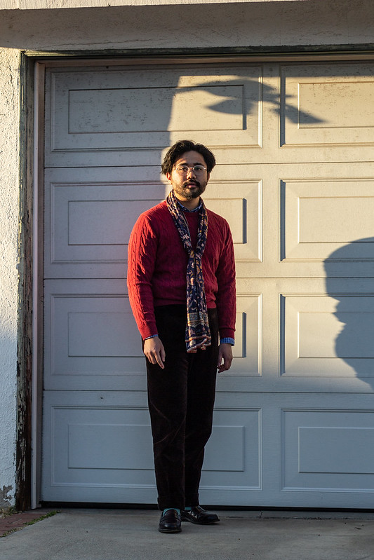
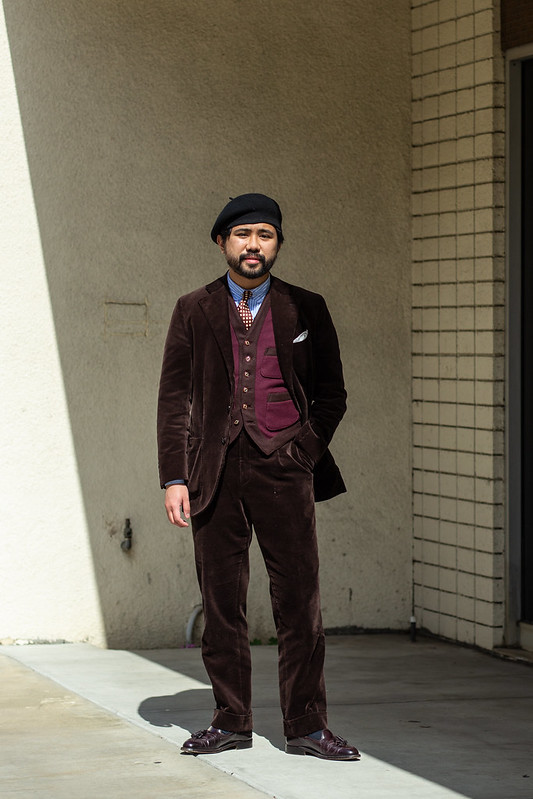
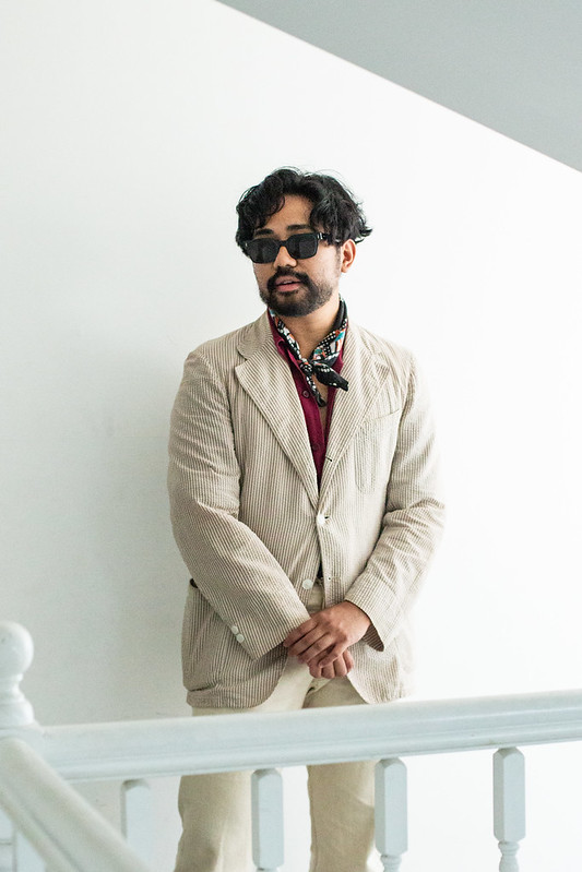
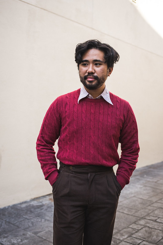
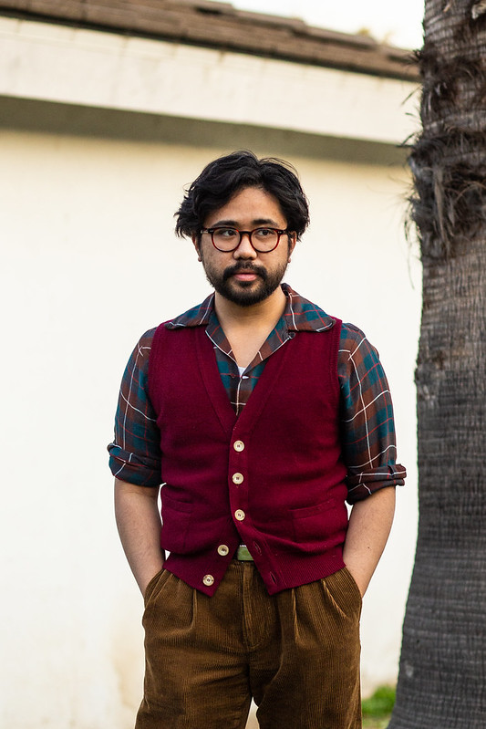
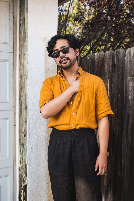
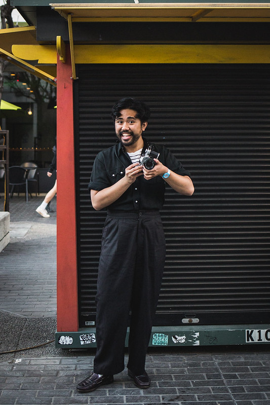
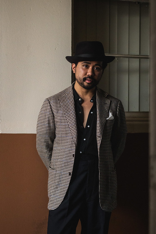
That mindset was later expanded to include knitwear, suits (my purple cord suit anyone?), and shirts. Shirts I think are the hardest to inject color into since it ties right back to the story I related in the beginning- it reminds me of prom shirts. But maybe that’s because the shirt itself was bad. A solid black or purple cotton-poly non-iron shirt with a skimpy collar is just bad. But a shirt in black linen or a green gabardine shirt? That works for me. The more intentional details help show an evolution in taste and execution, but honestly, the mindset didn’t change too much. I wanted to wear that color because I liked it, so finally decided to use it as a shirt.
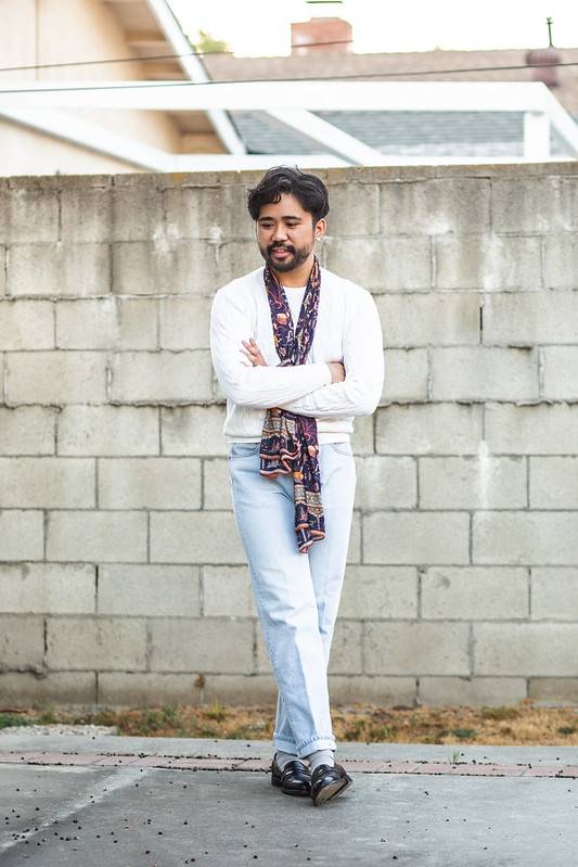
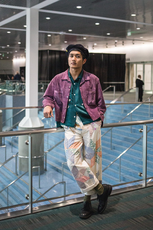
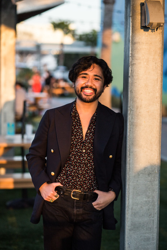
Even if pushing for one color is a great move, I actually think that my preferred of playing with color focuses on combinations. It’s less about emphasizing one color but rather how different ones work together- and what cultural or social messages they can bring. The use of color seems to be a battle between how playful you want to be and how much you want to lean into it. Certain colors (with varying degrees of saturation and brightness) can evoke seasons or allude to a personality, which is why I’m interested in how it works together. Let’s not forget some pairings can make one seem bolder than the other, which still plays into the POV you have.
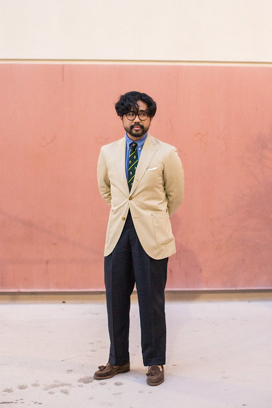
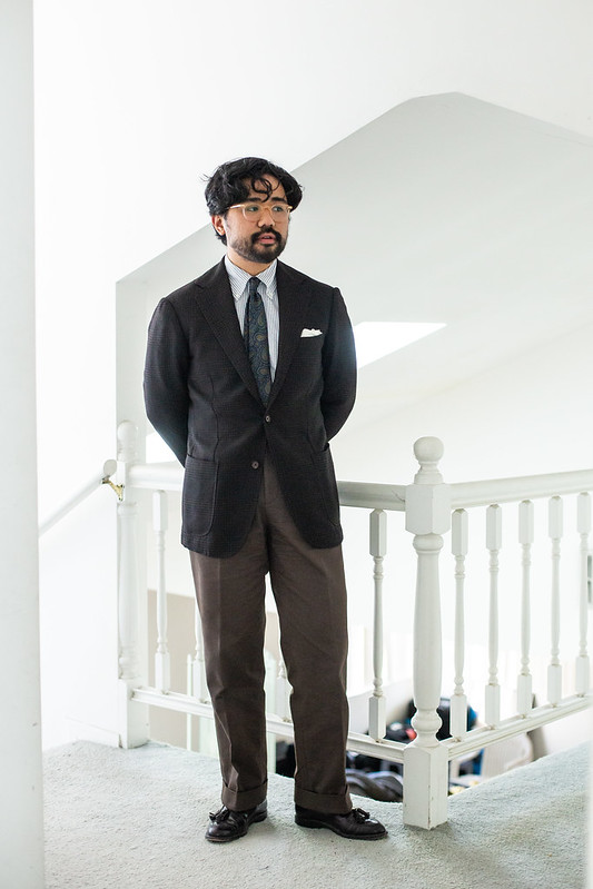
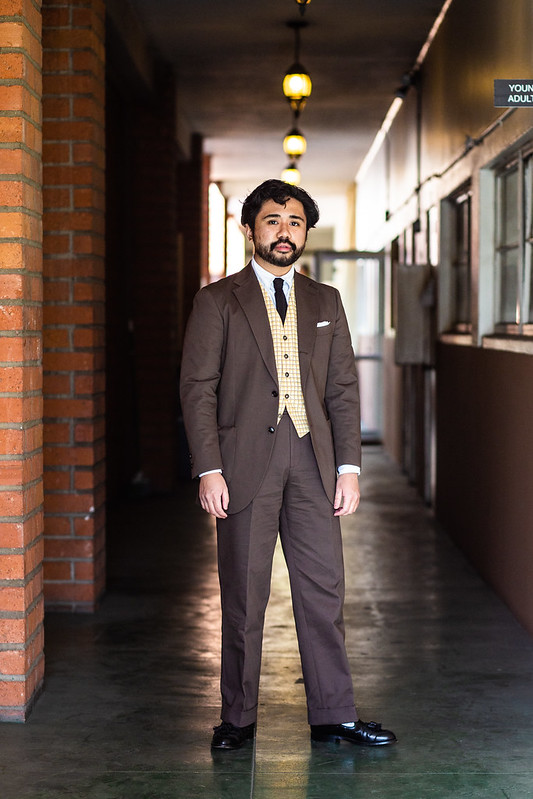
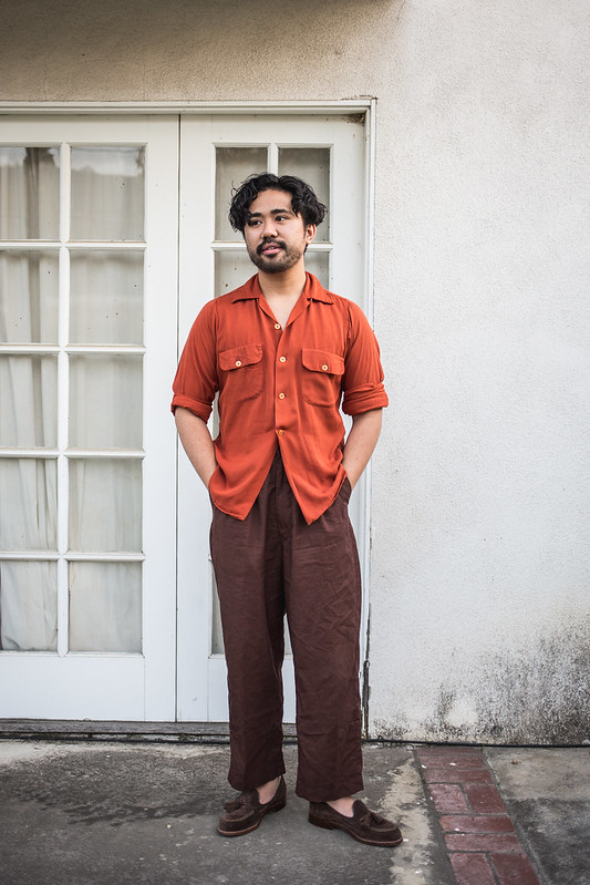
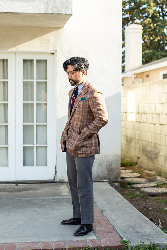
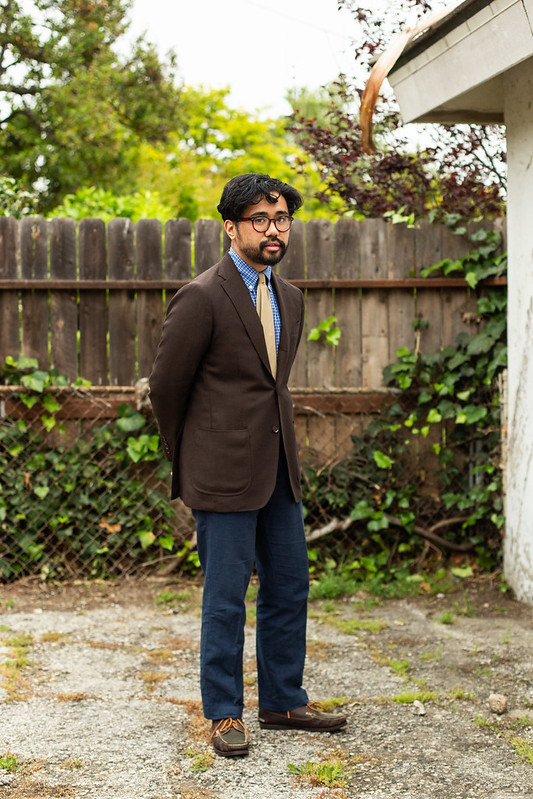
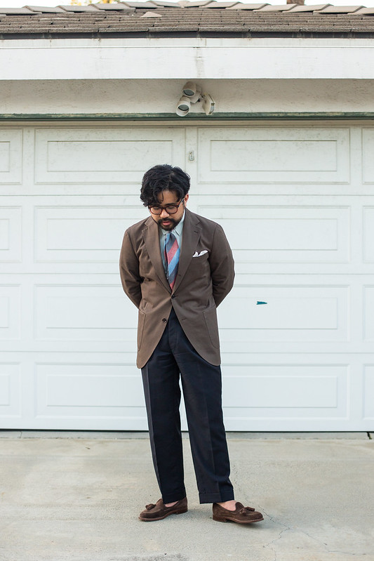
Pairing a color with extensive connotations (which can be vibrant or not) with another to change up the message is all the fun. Casual attire is usually easy but tailoring (as you could expect) is where the true fun comes into play. You can routinely see old Drake’s photos making use of colorful striped shirts and abstract ties against muted tweeds, echoing how the Esquire men did it during the Golden Era. It’s a classic, which I’ve done myself, leading to how I like striped shirts for their ability to play with multiple colors in various shades; it’s much more interesting than just a solid (though solids have their place). And let’s not forget how I’ve stated repeatedly that dark brown (in solids and checks) just looks older and more “mature”. It’s why I prize it over lighter shades, which often feel too “young” or iGent.
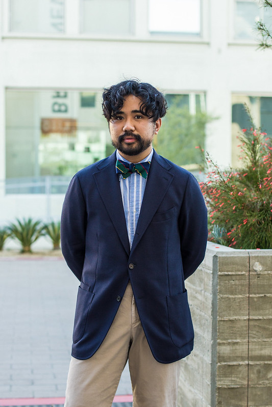
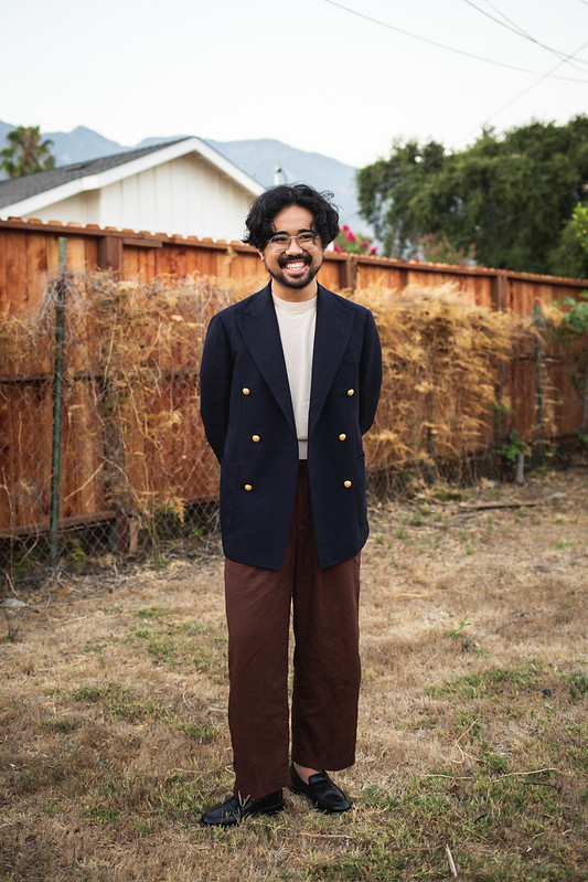
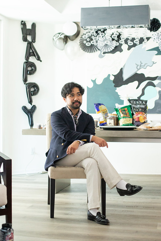
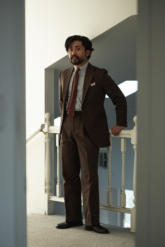
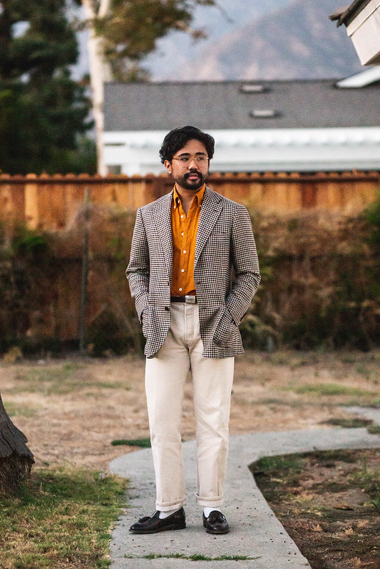
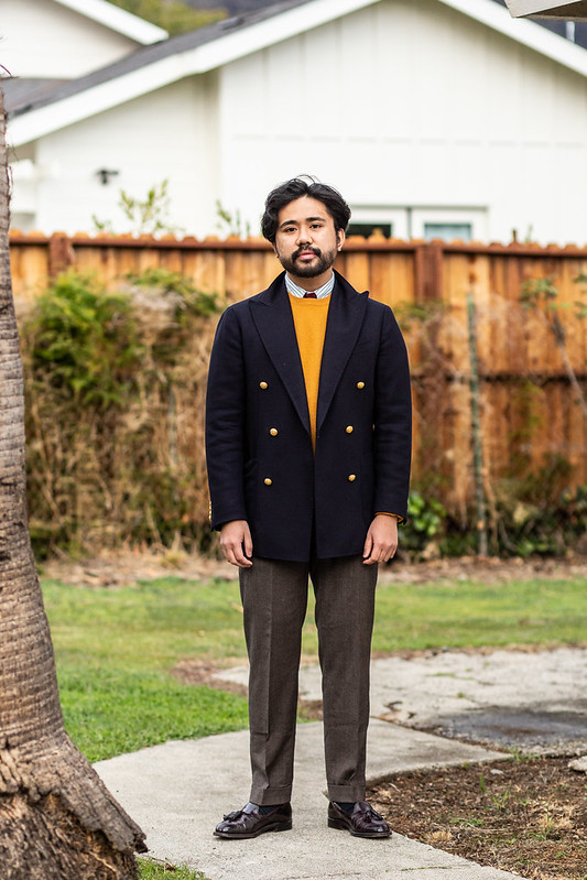
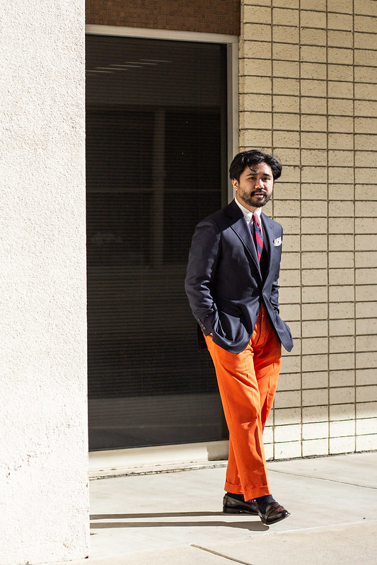
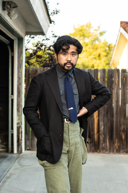
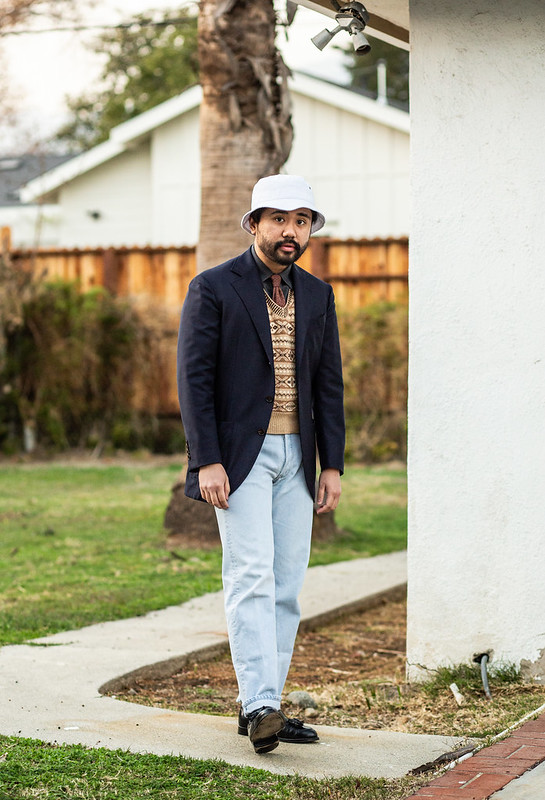
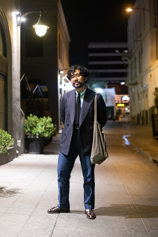
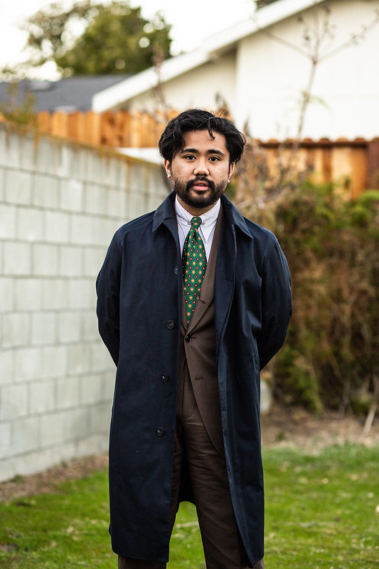
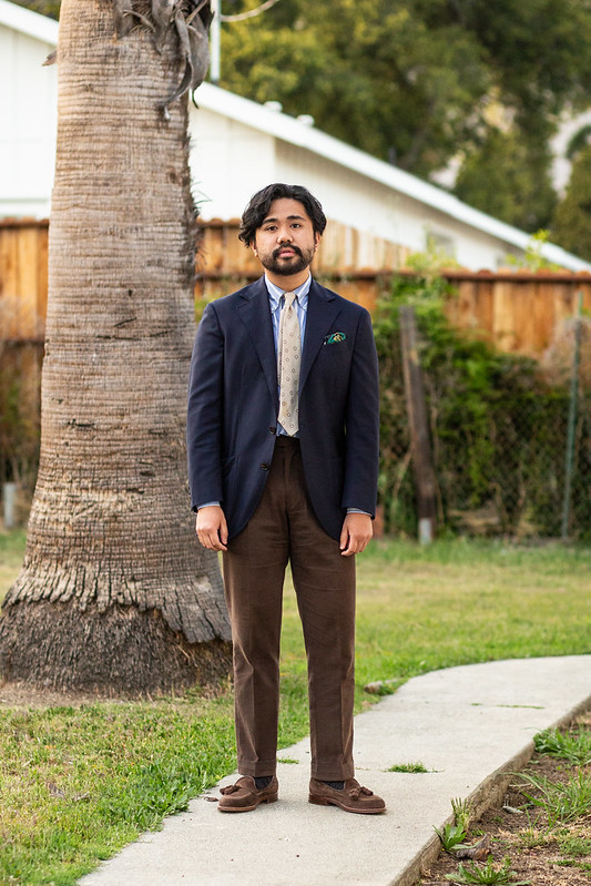
Outside of specific shirt and tie combinations, one major way of how I combine colors comes through in how often I like pairing navy jackets with brown pants. Now obviously this is a classic combination that has precedent across different eras; it’s also quite harmonious (probably the only reference to color theory I can think of). However my extensive use of this combo is due more to the fact that I don’t want to default to navy + grey (security guarding/#menswear) or navy + khaki (too preppy). To me, darker shades of brown trousers feel like an intentional choice, one that goes against the grain of a typical menswear choice. Of course, it’s also fun to play into those traditional pairings.
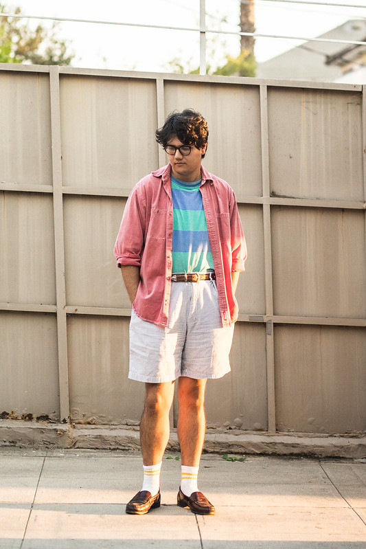
Different combinations occupy different things in my mind. Green + brown feels vaguely militaristic. Black + brown is 70s. Green + white is peter griffin. Khaki + red is Target (light blue + khaki is Best Buy or a Helpful Honda Person). Red and blue is patriotic. I’m sure if you think hard, you’ll find some sort of unfortunate connotation that a combo can have. But that only applies when the colors are so prominent. In reality, we have so many different pieces within one outfit that color can be diluted across. This is where the fun of dressing begins, where you get to try things out and see what works, not only based on color harmony but on the look you want to create.
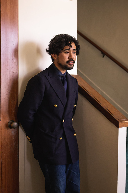
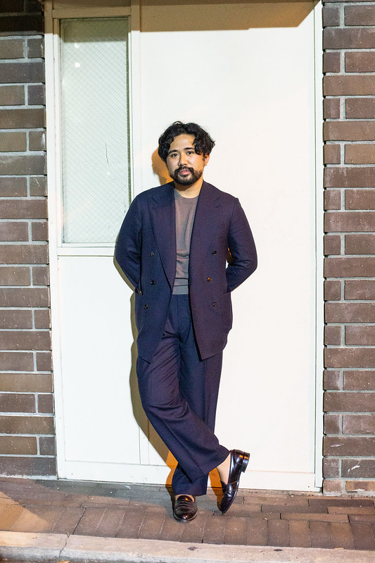
Navy and grey are great options for a suit, but I prefer navy simply due the depth and versatility I perceive from that particular shade; brown is a second for me due to the same reasons. Grey just isn’t as useful to me in comparison, even as many others seem to be able to use it just as much as navy or brown. Though as I now stare at my sea of blues and browns, I actually feel like grey would be a fine addition. Wild how color can come and go in our tastes!
Overall, like with all things I ramble endlessly on in the pages of this blog, the use of color within menswear really just depends on your own taste. After all, color is what could turn a suit look from being corporate (like J. Mueser with their use of somber solids) to something more intentionally fun like Drake’s (who uses color quite often in their looks). With all the messages that color can have, there isn’t a right answer on how to incorporate it into your style, but rather a right answer for you, leaning on the connotations that you develop on your own as you navigate your style journey. For me, it leans into dark colors in suiting and saturated casual pieces like knitwear. I either play into it or subvert it at will.
I firmly believe that everything in menswear is an exercise in POV and color plays heavily into that, even if it is internalized. We all have a sense of what colors we like and after while, you know what clothes and aesthetic you like. It’s totally possible to have some fun with color in menswear (or at least vague menswear). You just have to get the taste right.
Podcast Outline
- 08:19 – Topic Start
- 10:47 – History of Color and Menswear
- 15:51 – Eric on Color
- 37:38 – Color and Formality/How it Translates Now
- 41:47 – Colors Tying to Eras/Vibes
- 53:40 – Color for Aesthetics
- 56:27 – Modern Cloths
- 1:00:30 – How Deeply Do We Think About Color
- 1:09:44 – Skin Tone
- 1:13:53 – Color Combos
- 1:23:48 – Wrap-up
Recommended Reading
- Colorful Pants
- On Fun Socks
- Put This On- How to Think about Color
We followed up the pod and essay with a discussion on stream. Eric actually joined us for it and used his knowledge of graphic design to give us more insight on how people think about color. We also muse on how difficult it is for guys to use it effectively.


Thanks for listening and reading along! Don’t forget to support us on Patreon to get some extra content and access to our exclusive Discord. We also stream on Twitch and upload the highlights to Youtube.
The Podcast is produced by MJ.
Always a pleasure,

Your writing style makes it so easy to understand.
LikeLike