
Apparently I’m just inching closer and closer to being a preppy asshole. I already wear my sweater on my shoulders and wear beefy OCBDs, so this seems like the next plausible move to add to my ever expanding toolkit of classic menswear.
Introduction

Every time I think about bold colored pants, I think of my old church friend Vincent. As a nerdy, shy, unathletic guy, I always thought that Vincent was pretty cool- he played guitar, worked on cars, and was damn good on a skateboard. Unlike me, Vince went to public school, which meant that he was actually able to wear whatever he wanted, which typically was in typical skate style of the late aughts and early 2010s.
One of the hallmarks of his style was a bold pair of skinny jeans. You guys probably know this quite well. You could go into Pac-Sun, Zumies, Hot Topic, or even H&M to find denims in ketchup red, deep purple, or even mustard yellow. Despite their obnoxious colors, the jeans seemed to work with skaters like Vincent, who would wear it with plain button ups (or dark graphic tees) and dark vans. Maybe it was a way for these guys to show that life wasn’t always about black jeans and similarly monochrome checkerboard vans; skaters could dress joyously, it seems.
I personally didn’t buy into that look, even though I thought it was cool, but it did remain in my mind as I began my menswear journey a few years later.
I wish I had some photographs of Vincent and his bold colored jeans.
Prep

I’m not sure where skaters got their bold pants from, but when looking at the classic menswear world, the evidence seemingly is analogous to preps and their predilection for the Go-To-Hell trouser.
There is a fantastic article over at Ivy Style (despite its problems) about this phenomenon, with the main thesis being that these WASPs, with their relatively conservative attire allowed themselves to “let loose” with certain garments; the GTM term came later by way of Tom Wolfe. While a khaki and Nantucket Red may be made of the same chino twill, one skews conservative while the other signals that you’re off duty- the same could potentially be said for critter pants bold tartans, or even vibrant Shetland sweaters. Though for the purposes for this essay, I’m mainly going to talk about the Bold Colored Trouser, as I don’t have any of those other items (yet).
This mentality makes sense to me, considering a many an essay on this blog is about classic menswear with a “twist” (a cringe phrase). Like I’ve said before, tailoring and trad attire in general were what most guys wore all the time at least until the 1960’s. Sure, workwear and other sportswear is often mixed in, but they were much more informed by tailoring rather than casual for casual’s sake. I need not remind you the Die, Workwear tweets about how patch pockets signify casual wear over jetted or flapped pockets.
GTH is a different thing however, as it involves personality and casual-ness in terms of bold colors and patterns rather than overt details like pleats or cargo pockets. It’s the same overall garment, just a bit louder. And people have been doing it for a while. I mean, this is technically how we approach some of the basics of sportcoats: solid navy and grey are business while browns and checks are for casual attire. Obviously we have since lost that idea, as anything related to classic menswear is seen as formal nowadays, but to those who wear tailoring everyday, colors are a great way to separate the formal from the fun. After all, prep seems to be the casual relative to trad.
Perhaps that’s why prep is having a bit of a resurgence in the menswear world, especially as we move out of the pandemic. We’ve had plenty of other influences come in over the years, like wearing workwear with sportcoats, incorporating minimalism, and now prep is coming in full force with a new merch/streetwear attitude that I think actually makes it much more palatable The ideas of repp striped (over plains) and OCBDs (over stiff spread collars) is happening, and I’m not surprised that bold trousers added to the mix, though its still pretty rare (despite the fact of how common it was in the past). I guess men have found different ways to dress down and be bold!
Perhaps revisiting the attire of the priviledged in a semi-ironic way is how classic menswear will survive in a world where business and formal attire is seemingly at an end. After all, the idea of classic menswear as “just clothes” is what made it intriguing to me and why I feel like I can make it work as my everyday look. The trick is to not look like Andy Bernard.


Today

The guys who do the Bold Colorful Trouser are probably some of the more “advanced” guys in the menswear space. For example, you don’t really see Mark Cho doing it, but you will see Ethan Newton and Tony Sylvester pulling it off. It’s because the bold trouser is truly an investment; a bold jacket can be calmed by somber trousers, but a bold trouser is instantly recognizable, especially once you take off your jacketing layer. This is why it’s easy to have “fun” pants that aren’t bold in color, but bold in detailing, in that they point to a contrasting aesthetic like milsurp or workwear or just seemingly are incongruous with classic tailoring.
I mean I get it; Bold Colorful Trousers are a tough sell. They’re too formal in design yet dandy in color. It won’t fit into most wardrobe’s anyway! I’d even go as far to say that a Bold Colorful Trouser is also much different than plaid/tartan or critter pants (which I actually think are easier to wear). But that’s the point; once you’ve done a lot of mixing in selvedge denim, military chinos, and wide legged pants, going bold is naturally the next thing, almost like coming full circle toward prep, a look that has been largely avoided in classic circles for nearly a decade. It’s not for everyone, but these guys are certainly not everyone.
Sometimes you just gotta dive into that POV! Like a blazer, these trousers tend to be attributed to prep, at least in my mind). It inherently introduces as specific aesthetic, allowing you to either play into it or subvert the vibes entirely. The efficacy of execution will depend on the Rule of Cool, but its a fun challenge if you’re an advanced dresser in classic menswear, especially if you’re into doing things in a non-straightforward way.
That’s probably why Ethan Newton and Tony Sylvester do it. They’ve already made a name for themselves for this “rugged menswear” look, so going the opposite direction and leaning into preppy GTH tropes is another way to have fun with classic clothing and subvert expectations. I’m not sure if its exactly tied to those skater looks, but for me, it’s hard not to make that connection. Especially since a bit of skater style is derived from classic Americana.
As you’ll see in the following images, Ethan and Tony (as well as a few others) lean into it at times, looking like a preppy, rich asshole. Other times, it’s used as a stark contrast to the other elements of their outfit. As I have covered plenty of times during the tenure of this blog, its that the rich history of menswear is ripe to be manipulated to however you see fit. And sometimes, you do want to return to the good old days of 1980s prep (or RL Rugby) and just go for it.
With ample slouch, it ends up looking easy despite being a bold color choice. It’s almost as if they put it on and forgot how wild it is. It’s a skater (or punk rock) mentality, I guess.


There are quite a few things to note from this. Firstly, that a bold colored trouser is absolutely appropriate across any season. A lot of people attribute these types of trousers to summer (presumably due to the preppy guys in boat shoes and a blazer), but the examples above should show its versatility. After all, you can wear a military chino in spring and fall, so why should a Bold Colored Trouser (that is typically cotton twill) be any different?
It’s that thinking that lead me to realize that bold colored trousers really aren’t that different than anything else that we typically wear. You may scoff, but let’s not forget that chocolate cord pants are a favorite of guys who are tired of grey flannels and chinos; why else is a brown suit recommended after navy and grey? Or let’s think about how white jeans and cream linens are the favorite of every menswear guy in summer! Is not a bold trouser in that same vein? Its imply taking that throughline and moving to the next step: injecting a bold, solid color. You just need to pay attention to the color’s depth and how it contrasts with the other pieces of your outfit.
That’s why it’s also important to take cloth into consideration. While cotton twills or chinos are probably the most common (echoing how in the mid-to-late 2000s, I saw jeans of every color in a store), its clear that texture helps make the Bold Color much more palatable, whether its a deep purple or a vibrant yellow. This is presumably because the raised fibers on a flannel or corduroy help turn a saturated color a bit dusty without fading away too much. Even the wrinkling on a linen or the visible wales of a cavalry twill are enough!
That attention to texture this is what makes them an effective trouser, as this emphasizes the easy-going nature of the Bold Colored Pant as a perfect alternate to a grey flannel or a chocolate corduroy. Conversely, I don’t think that such a bold color looks good on a silky smooth super 120s+ wool worsted. After all, there’s a reason why bold colors are done on shetlands and lambswools rather than an ultrafine merino. The connections between the GTH Shaggy Dog and these trousers are quite apparent!
You can definitely see that there is a bit of restraint that these men use when wearing it. For the most part, it’s thought of as a bold tie or even a brown checked jacket– everything else is kept fairly muted. There is an astounding use of navy jackets (and blazers) here which does an effective job in muting the trousers. It’s a similar method when I wear military pieces with denim: it’s best to keep the jacket somber as to ensure that the whole outfit doesn’t get too peacocky.
While there are a few fits that seem pretty preppy (like Tony’s use of the Shaggy Dog sweater or Ethan Newton wearing a literal navy blazer with brass buttons), they’re all done tastefully. You won’t find boat shoes and a cheesy club motif tie here, though I’d be intrigued to see if one of them could pull it off. Even Chase, who wears it with a madras shirt seems cool in it, though perhaps that’s just slouch in action.
Looking over the fit pics above, it’s almost as if these men know how “ridiculous” the trousers are, which is why they wear them seriously. It also looks like they had a last minute swap for the pants in their outfit: the grey flannels turned into purple cords or Nantucket red chinos. In a sense, it’s almost like the pop of a bold colored sock or wearing a sneaker with tailoring; unexpected, but it makes sense if done well with the right amount of restraint. It’s not exactly out of left field, but simply a fun take on something you already own (you own trousers, don’t you?) They have to be an intentional piece, as they will always lose to a “sensible” color everytime. You just gotta own it!
On Me

The “trend” of bold, colorful trousers is not something new to me. In fact, I was always into it and owned two during the early days of the blog. As you can expect, I no longer own either of them.
The first, which you see above and worn with an ungodly prep-inspired look, was a pair of nantucket reds that I bought second hand on eBay. I’m pretty sure that the late prep revival in the late 2000s and and the plethora of #preppy outfits on Tumblr were what inspired me to make the purchase.
Unfortunately they were just too uncomfortable to wear. The chino (maybe it was part poly) was stiff, the rise was so short, and the taper (I brought it to my tailor as soon as I got them) was too much. I also felt a bit too weird whenever I wore it! I obviously didn’t have the wardrobe I had now, so it was a bit tough to pull them off. I either played too hard into it or wore them too plainly, in which I was too aware that a different piece would much more effective. I know that intentionality is the name of the game, but I didn’t have that intent.


The second bold colored trouser is one that I actually loved: purple chinos from Uniqlo. These pants were purchased a bit later in my menswear journey, so I was actually able to wear them a bit more effectively (though still cringy).
I’m not sure why I liked them more. Maybe it was the fact that they had a peached texture (similar to the Stoffas I own now) or that they were straighter in the leg than the Nantucked reds before them. It could also be the simple fact that purple is my favorite color and as such, I liked wearing them as much as possible. It helps that the color wasn’t too saturated (a darker shade is easier to wear than a lighter one) and that the fit was marginally decent for my style.
They proved pretty versatile and served to quench my thirst for the purple skinny jeans that Vincent would wear. I ultimately gave them away as they shrank on me over time. I also got them hemmed too short when I was over-correcting on my aversion to breaks, and you guys know that I can’t stand trousers that don’t hit my trousers!


After getting into classic menswear more and finding a way to mix it with my vintage preferences, the Bold Colored trouser faded. I moved away from “dandy” pieces as I looked to wear more mature garments that fit my POV. I spent my time trying to find high rise, straight/wide chinos, flannels, and denims, not to mention good jacketing. A bold colored trouser (that wasn’t white) didn’t sit right with me, with me anymore especially as I felt that straight (or wide fit) fit pleated trousers, spearpoint collars, and fedoras were already personality-filled enough. I wanted to be taken seriously, damn it!
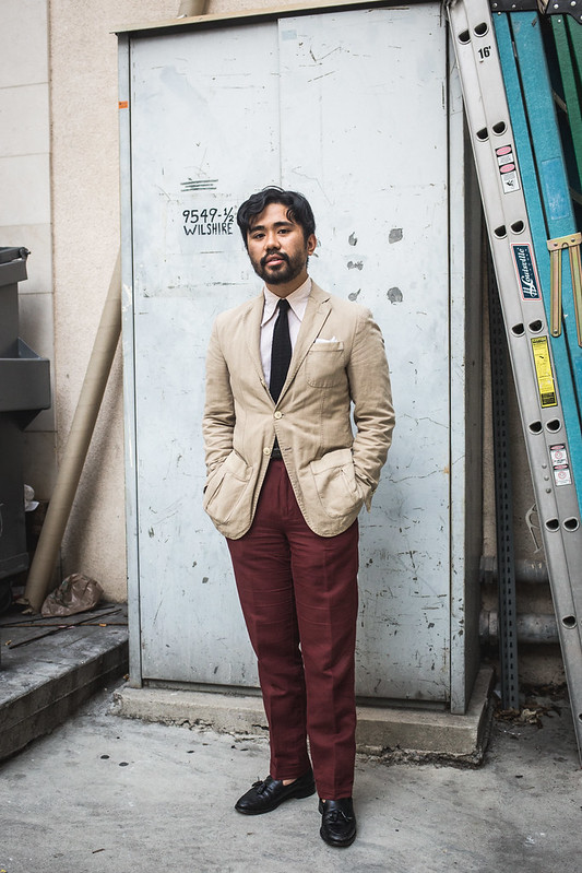
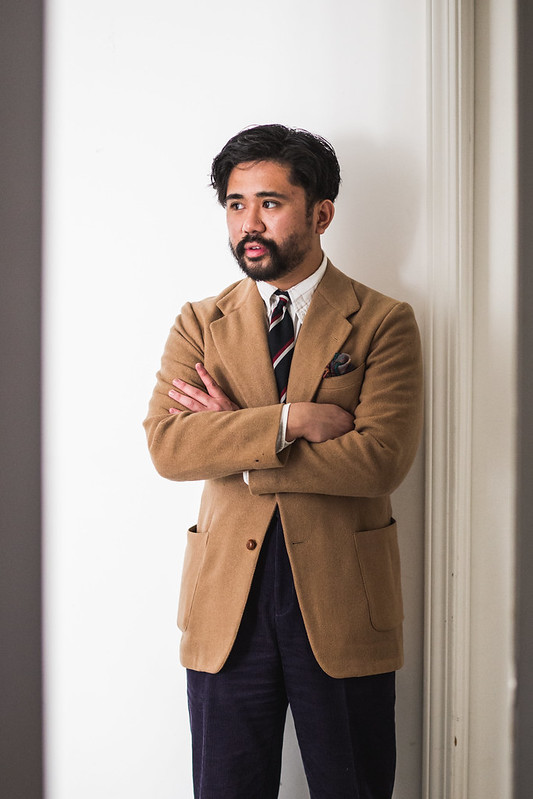
All of that was a lie because I actually bought a pair of bold colored pants a year after I gave up those Uniqlo purple ones; I used my employee discount at Banana Republic, which makes them one of the few things I bought during my sales associate days. Luckily at this time, I was already starting to hone on what my preferred trouser fit was, so these weren’t going to be tapered and hemmed too short. Instead, these brick red cotton-linen HBT trousers (flat front) remained at their OTR width, just with a good 1.75″ cuff added. Despite being slimmer than what I wear now (9″ for the most part), these red pants have held a special place in my closet (and heart) since 2016.

The fact that you see them with bearded, messy haired Ethan should tell you how much I enjoy them. Firstly, the cloth is stellar, providing a cleaner drape than standard linen; the HBT is also a welcome change than just a regular plain weave. The slightly muted color is versatile enough to wear across a variety of outfits, though I love pairing it against browns of varying degrees. This might have been a conscious choice as I didn’t want to repeat the Prepmaster5000 looks I did with the pinks. Obviously these brick red trousers aren’t inherently ivy-prep, but they were enough for me at the time.
While these are overall pretty somber compared to the inspirations earlier in this essay, wearing them regularly did prove to me that a bold colored trouser certainly had a place in my wardrobe, even if it was a potential one that wasn’t exactly filled yet. After all, I used these pants anytime I saw style inspiration wear their bold pants. The fact that these trousers are only appropriate for summer (I’m not about to wear cotton-linen with tweed) meant that if I were to abet this yearning, I would need to expand and find others to wear in other seasons.


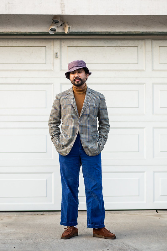
One helpful piece toward wearing bold colored trousers was acquiring these vintage HBT cotton work pants at my local flea market. You might remember them from the essay on Fun Pants.
I originally intended them to be a denim alternative, but I guess I didn’t notice how blue they were until after I got home. The pants still worked with a chore coat for a tailoring-adjacent look, but I hesitated wearing them with a sportcoat because I felt the contrast was too great. After all, they are much more vibrant than the brick red trousers, though the more visible HBT gives it some visual interest apart from the color.
Luckily quarantine allowed me to experiment freely without wondering if it was appropriate enough for “outside”. And to my surprise, they work great! Obviously they already have inherent character like a typical military chino, but I’ve started wearing as an exercise of color. You can see that it even works with a brown checked jacket and plaid shirt without looking “too much”. I will admit that they aren’t reached for as much as the red trousers, but I liked the idea.
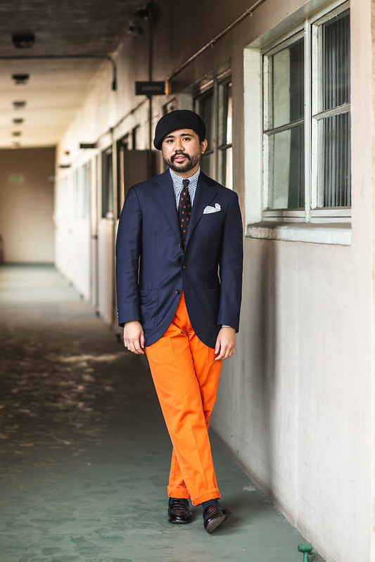
The real foray into GTH was rocking these orange pleated chinos from Magill (gifted to my by their founder during the summer). They provided a real challenge because not only were they vibrant, but orange is truly unconventional color- at least blue and red have real roots in classic menswear! However, I knew it was possible as Tony Sylvester wore his with ease. Plus, I knew I wanted something to get more into prep rather than ivy, as a way to add some fun-edge to my style.
A navy jacket is the best way to immediately calm the trousers. Sure, it may play into the preppy douche bag vibes, but that’s why it’s important to treat it as just an intentional (yet unexpected) replacement of a regular trouser. That’s why it’s worn here not only with a navy jacket, but striped shirt, foulard, and black penny loafers; a beret gives it some extra edge.
I’ll admit its not my best look, though that isn’t the fault of the trousers. I think the main issue is the tie, which despite being a burgundy foulard pattern on a black base, comes across a bit too “Halloween” when worn with the pants. A repp stripe or knit tie might have been a more effective fit.


Now I think that the above fit is much better. Here, I play much more into the edgy nature of bold pants, wearing a black polo and DB blazer as a monochromatic top, echoed on the bottom by the use of slick black chelsea boots. The lack of a tie makes this easier to swallow!
I will retroactively add in any fits that combine these orange chinos with proper tailoring (aka with a tie), but for now, it seems that keeping it simple is the best way to move forward. Open collar spearpoints, crew neck sweaters, and turtlenecks are all going to be used with these trousers. The color is fun and subversive, so I have to get used to letting it be the star by wearing it with other darker colors (like navy blue or black). It is a cotton twill after all, so its definitely harder to match than the previous two which have a more texture and a different weave.


Now you know I don’t normally repeat outfits, but something about that first outfit with the orange pants just felt off to me; I feel like I deserved a second go, especially since I had already worn the chinos quite a bit. This time I followed my own advice. The look is much more ivy-prep, swapping out the spearpoint and foulard for an OCBD and block-repp stripe tie. It’s much more understated and easier on the eyes, I think.
Originally I was going to shoot this outfit without a hat, but I felt like the look was too plain. If you just put everything on paper (sport coat, ocbd, repp tie, chinos), it just reads a bit boring. Plus, I felt that that the vibrant pants were just a bit over powering for the safe top block. Incorporating the bucket hat makes for slightly irreverent Americana look and actually makes a better case than the beret. In the end, I do think that a patterned jacket (like the grey tweed above this one) is a more effective combination (and doesn’t seem to “require” subversive headwear) than a navy sportcoat, but hey, I really wanted to do prep with these GTH orange chinos.


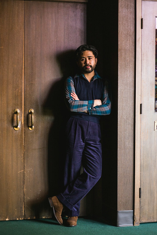
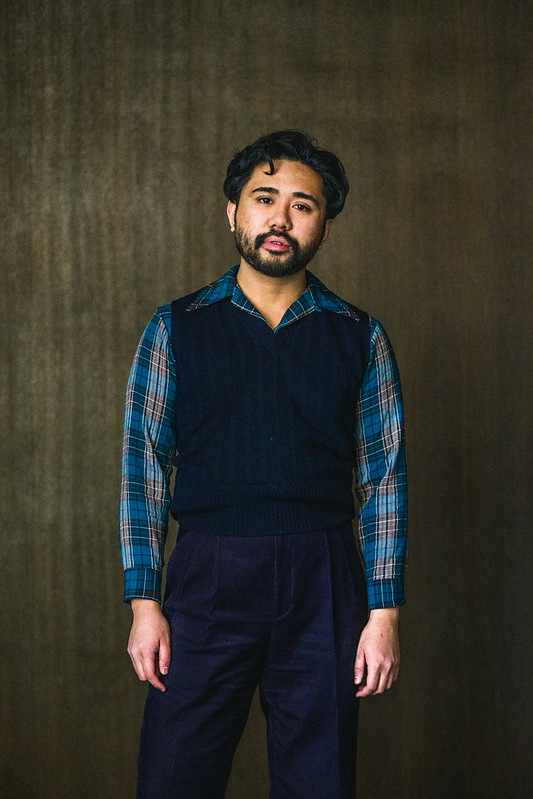
I’m finishing off this blog post with what is probably my current favorite trouser in my entire closet: purple corduroy trousers (part of a suit), a made-to-measure commission from Atelier Fugue, the maker of my beloved cotton suits. It’s unfortunate that its currently too warm to wear it regularly (I shot this in February), but damn did this get me fully onboard the bold, colorful trouser move.
Like I said before, purple is my favorite color and it makes me happy to finally wear it proudly. Since it’s a bit non-traditional for classic menswear, I thought it would only be good for limited use: the patterns or stripes in a tie, the color of a solid sock, or between white as stripes in a shirt. However, as I wrote this blog post (I started it in the summer of 2020), I realized that it could definitely work as a bold trouser, especially when its cut from corduroy, which as we know, makes jewel tones (or any vibrant color) appear dustier. After all, Ethan and Tony wear theirs well- I just wanted to do my own spin.
So I’ve been wearing these trousers a lot. And man, do I love it. I feel so incredibly powerful. Not only is it refreshing to wear something so bold, but it’s also such a regal color. It’s definitely in the GTH spirit, but rarer and more refined. There’s a bit of evening wear mixed in (a la purple velvet) with a touch of English gentry. In the past, I simply liked the color because it was edgy and very Hot Topic; now it has taken on so much more!
And yes, these outfits were worn before it got hotter. Though now I’m thinking just how versatile a purple linen could be.

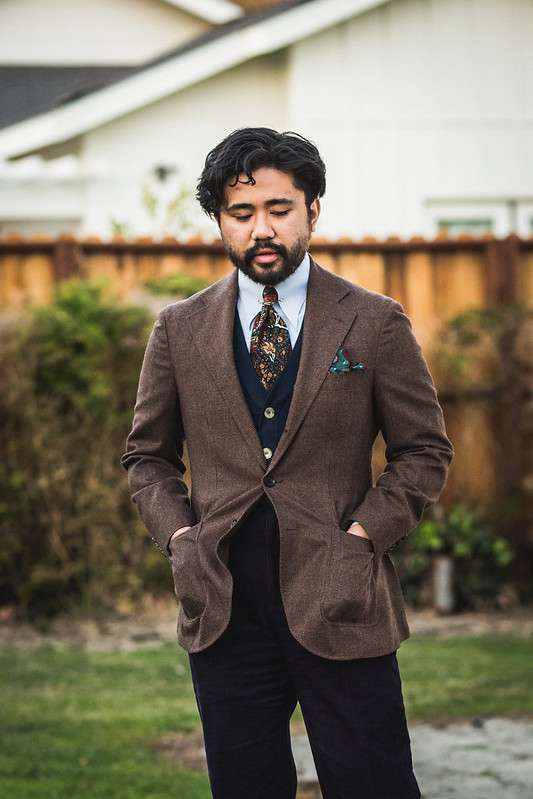
Naturally the first outfit I wore with these custom purple cords was with a navy blazer and a beret, to shout out Ethan Newton’s iconic Pitti fit from a few years ago (its included in the inspiration section. It’s just such a great match for a blazer, especially a DB one. A pinned club collar and an equally vibrant green/yellow repp/club tie points even more to a rich English asshole vibe, which I delightfully love. It’s not overly preppy as an OCBD and boat shoes, but like with the orange chinos, I think this way is a much better take.
The entire outfit is ultimately equal parts a serious and ironic cosplay, all thanks to the use of purple cords. After all, a chino would’ve been too on the nose, a grey trouser would be too boring, and jeans would just be a cop out. A bold, deep color makes it fun, yet entirely natural for this look. Honestly, I don’t think any other trouser could have been as effective in providing the right amounts of irreverence and slouch. That’s the best part about a bold colored trouser.
Plus, this isn’t really too far of than a brown corduroy trouser. It’s just bolder.

I think it’s even effective without a jacket (which is crazy, because I typically don’t break up suits very often). I think we all know that a full cut OCBD or a tucked crewneck would be a welcome partner, but I also enjoyed wearing it with a turtleneck base layer and fair isle swaeter. Again, jeans or a chino would have been fine here, but the purple makes it more interesting. It’s not exactly goth in a sense, though it definitely points toward that direction. I mean, I’m literally a Hot Topic kid (but not a cool skater one), that grew up and got into classic menswear- this outfit is a good indication of that.

This last outfit was made because I wanted to lean into the fun trad-prep vibes of GTH, especially since the fit with the blazer felt like too much of a cop out. You really need contrast in order to see the purple, as dark as it is!
So for this delightful winter trad look, I brought out my 1940’s camel jacket. With it’s soft shoulders, wide lapels, and massive patch pockets, it’s probably the closest template I’d have to recreate in a bespoke commission (though my Ascot Chang jacket is quite close). The honey/tan shade is was a great pair for the trousers, as I thought a checked tweed might have been too much. After all, I’ve been angling to wear my solid jackets more! I also echoed the camel with my yellow socks.
It’s a lovely match I think, especially since my only other dark cords would be chocolate, which wouldn’t be a good match. The outfit really illustrates that purple (and other bold colors) can be creative alternates to typical menswear choices, especially in cord. It’s sensible, yet is much more fun the closer you look.
A vintage stripe OCBD was the shirt of choice, as it wasn’t as obvious as a university stripe (and certainly not as jaunty as a spearpoint). I matched it with a black/red repp, which provides a “dark” vibe to the fit and complements the purple cord. I’m pretty sure I was referencing my black and purple studded Hot Topic belts from high school with that, though it’s all hidden under the trad.
I guess this is the closest I’ll get to being that skater guy I could never really be!


Okay, I lied. This is the final outfit of the bunch, worn when it was actually getting warmer! I brought back those Magill pleated chinos and as I suspected, they really work well with a Navy Blazer with Brass Buttons. Most of my spring-summer jackets are either white or brown checked, both of which aren’t really the right choice for a bold colored trouser (or perhaps that’s a challenge I need to try and retroactively add into this essay).
This look is quite similar to the one with the beret, blazer, and purple cords but despite the vibrance of the orange pants, this one is actually quite restrained. It’s a simple prep look, though it doesn’t look too Andy Bernard! It helps that the somber jacket is matched with a trad OCBD and a conservative geometric tie.
Since the best pairings seem to involve a navy jacket, I’m scared that my bold pants will only be relegated to neo-prep vibes. That source of inspiration is one of the tentpoles of the post-pandemic look, so perhaps that isn’t a bad thing! It just means that I don’t have to resort to simply wearing chinos or grey wool trousers. We can have fun with our pants.
Conclusion

Maybe Vincent will find this essay and be proud of me.
I never thought I’d ever write about bold trousers, because I felt that I’d never truly get into it. Bold colors is a bit too dandy and a move frequented by Pitti Peacocks, of which I can admire but not do for myself. I typically prefer to stand out by the mixture of details and sub-genres of menswear rather than colors. After all, wearing a denim shirt, workwear pants, white socks, and a flannel jacket shows that you care, but not that much.
What I didn’t expect is that after a period of trying to casualize menswear, you come to miss the elegance. This could come in the form of revisiting black in tailoring. Perhaps it’s about opting for full suits instead of separates. Or maybe, its about embracing your inner peacock and wear some bold colored pants. The only difference is that this move is pretty loud and can’t hide behind subtlety. It’s in a different vein than wearing white trousers or lightwash jeans, which is what most menswear guys do. But that’s what’s so charming about the bold colored trouser- it’s different but not really. It’s the same pant you typically wear, just with color!
It’s almost like being a kid again, where you wanted to wear your favorite colors because…well, you liked them. It’s no different here. All of the guys I’ve shown clearly have a love for these bold colored trousers and find a way to make it work. It’s not done because it’s the most effective choice, but for the simple reason that they wanted it. Sure, it has some preppy connotations in GTH, but you can see that you’re able to play into or subvert it in anyway you want.
Keep in mind that the cloth choice can make or break it. Worsted wool is almost completely abandoned. Flannel is a good choice, but I think it’s still a bit too plain. Doing a bold color in linen, moleskin, or corduroy is the best way to go, since the textures and weave help “soften” the saturation on the eyes, no matter the shade. That’s probably why so many of the outfits feature corduroys in yellows, purples, and pinks. Cotton twill is great if you’re going to wear it year round, though it’s certainly a bit harder since the color doesn’t “soften”.
This entire blog post is definitely an advanced move, perhaps the most advanced move I’ve ever written about thus far. It’s still proof that a style journey can go full circle and that is something to embrace, not avoid (especially if you love tailoring). What the hell, just be bold!
Perhaps the next move is to get plaid trousers and dive deep into embroidered critters. In due time, I guess.
Always a pleasure,

17 comments